FOLLOW US ON:
GET THE NEWSLETTER
CONTACT US
Astonishing illustrations from the set of Kubrick’s ‘2001: A Space Odyssey’
04.03.2018
08:47 am
Topics:
Tags:


Fifty years ago today, Stanley Kubrick’s singular motion picture 2001: A Space Odyssey, recently styled the “strangest blockbuster in Hollywood history,” was presented to general audiences for the first time. The movie was released during an unusually eventful week: Just four days earlier, Lyndon Johnson had announced that he would give up presidentin’ due to the increasing unpopularity of the military conflict in Vietnam. A day after the premiere, a bullet from the gun of James Earl Ray would end the life of Dr. Martin Luther King Jr.

In 1965 Kubrick hired a well-known British magazine illustrator named Brian Sanders to document the making of 2001. Sanders was given complete access to the production, to document the creation of the remarkable sets and so forth. Sanders would spend two days a week on the set drawing sketches and spend the rest of the week at his studio working on larger paintings. Kubrick singled out Sanders as the only person permitted to take photographs on the set.

Of his collaboration with Kubrick, Sanders said last year:
 

It was a wonderful brief to be able to draw on the set and go back to the studio to paint the bigger pictures. I could do whatever I wanted and it was absolutely lovely not working to a tight brief.

Also when I saw what Stanley had built, it was just incredible. There was the centrifuge, which you see the inside of in the film, with people running around the ceiling and various parts of it. That alone must have been 30 feet high. I remember when it started up for the first time, all of its lights were connected to one big console and they began to pop!

So he was very much in new territory, obviously in collaboration with other people but he invented new concepts such as a mounted camera where the actual camera itself would revolve. The invention was amazing, I was quite young at the time so to be able to work with him on the set was really incredible.

 
Many of the photographs would remain unseen for several decades. Secretive Stanley took the images from Sanders and did nothing publicly with them—only two images ever saw the light of day during the movie’s initial run. Sanders was disappointed, saying later that “the works never appeared anywhere in the end—it was a terrible anti-climax. I understood how the actors in A Clockwork Orange felt when he withdrew it from show.”

In short, every movie set should have its own documentarian illustrator.


Much more after the jump…...........
 

READ ON
Posted by Martin Schneider
|
04.03.2018
08:47 am
|
Stanley Kubrick auction includes a rare cut of ‘The Shining’ & other covetable Kubrick collectibles
03.22.2018
08:41 am
Topics:
Tags:


A military-style jacket worn by Stanley Kubrick on the set of ‘Full Metal Jacket’ up for auction
 
An upcoming auction run by Italian house Aste Bolaffi will be offering up an extensive collection of cinematic artifacts which have been held privately by Stanley Kubrick’s long-time assistant, Emilio D’Alessandro. D’Alessandro spent nearly three decades working for Kubrick as his chauffeur, estate manager and all around man Friday. Once a talented race car driver, D’Alessandro met Kubrick in 1971 and would bond with the director over their mutual love of Mercedes automobiles. In fact, D’Alessandro was the only member of Kubrick’s inner circle who was allowed to drive his prized Unimog—an all-wheel-drive Mercedes truck which Kubrick procured from a farmer while he was filming Barry Lyndon.

Among the treasures saved by D’Alessandro are items related to Kubrick’s many films including 2001: A Space Odyssey, Full Metal Jacket, Spartacus, Dr. Strangelove, A Clockwork Orange, Lolita, and of course The Shining. This brings me to what is perhaps the most compelling piece of Kubrick’s film history included in the auction—a longer cut of the film featuring additional scenes with Shelly Duvall and Danny Lloyd. If you’re up on your Kubrick trivia, you can understand the importance of this cut of the film as Kubrick was well-known for destroying things he didn’t want to be reused in the future—such as any footage from The Shining that was hanging around once filming wrapped. Kubrick also had props and sets used for 2001 destroyed to prevent them from being recycled for use in another film. Another cool piece D’Alessandro held on to was one of the burgundy corduroy jackets worn by Jack Nicholson in The Shining. According to folklore, Nicholson was adamant that his character Jack Torrance wear the jacket in the film and requested Oscar-winning costume designer and Kubrick collaborator Milena Canonero create a few for him. The starting price for the jacket is a cool $10K while bidding for the long cut of the film starts at a mere three-thousand bucks.

I’ve posted some of the cooler items up for grabs at the Aste Bolaffi auction (which starts on March 27th) that would instantly elevate any movie memorabilia collection to a much higher level, below.
 

A reel from the long cut of ‘The Shining.’
 

A pair of ink stamps used by the production management of ‘A Clockwork Orange’ and a film container.
 

A vinyl LP of the film soundtrack.
 

Rugs owned by D’Alessandro that were used in the Colorado Lounge in ‘The Shining.’
 
Much more after the jump…

READ ON
Posted by Cherrybomb
|
03.22.2018
08:41 am
|
Stanley Kubrick shoots ‘Chicago: City of Extremes’
08.24.2017
12:56 pm
Topics:
Tags:

06chikbrick.jpg
 
Stanley Kubrick got his first camera off his old man Jacques when he was thirteen. It was a Graflex Pacemaker with a coated lens, body release, and folding infinity stops. Kubrick wore it on a strap around his neck, took it to school, where snapped classmates, teachers, and events for the student paper. School bored Kubrick. He skipped class to take pictures around town. In the afternoons he’d go watch double-features at the local cinema. Some teachers thought he was just a below average student, but Kubrick’s IQ test put him up near the top of the class. He liked chess and read voraciously.

The Kubricks had a neighbor called Marvin Traub who had his own darkroom. Kubrick became friends with Traub and spent hours using his darkroom learning how magic pictures appear on paper.

The experience of taking photographs and watching movies made Kubrick want to become a film director. He started using his camera to make mini-filmic sequences with still photography. He was a big fan of Weegee and studied his work to learn how to capture character and drama in an eight by ten frame.

The big break came when Kubrick snapped a newsvendor looking long-faced, low-down and sad over the headline news “Roosevelt Dead.” The picture looked like Kubrick had captured an unguarded moment which reflected the mood of the nation. In fact, he had coaxed the vendor to look sad. He developed the picture and hawked it to the photographic editor Helen O’Brian at Look magazine. She paid twenty-five bucks on the spot for the image. It was Kubrick’s first sale and the start of his photographic career.

Kubrick started creating his own distinctive style. He became known for his series of photographic essays like the one of a group of patients sitting nursing gum boils and aching teeth at a dentist’s waiting room. Kubrick told the patients just how he wanted them to pose in the shot and then click-clicked away. He always shot more than he needed—but only ever presented the photographs that worked best.

In 1949, Look sent Kubrick to Chicago to document life in the city for a photo-spread called “Chicago—City of Extremes.”  Kubrick photographed morning commuters, traders on the stock exchange floor, kids at school, women at work, tenement familes, and the vibrant nightlife. These high contrast pictures were like an artist’s sketches for a bigger artwork. His pictures of traders looked like a rehearsal for the chaos of the War Room in Dr. Strangelove. The wrestling match with Gorgeous George anticipates the boxing scenes in Killer’s Kiss. And so on. Kubrick was honing his talents to become the director he knew he was always going to be.
 
016chikbrick.jpg
 
07chikbrick.jpg
 
01chikbrick.jpg
 
More of Kubrick’s Chicago, after the jump…

READ ON
Posted by Paul Gallagher
|
08.24.2017
12:56 pm
|
Amazing fashion knitwear sold as a tie-in to Stanley Kubrick’s ‘2001: A Space Odyssey’


I’m a big fan of Stanley Kubrick’s 2001: A Space Odyssey, so when I caught wind of this amusing archive find over the weekend, I knew I would have to pass it on.

Dave Addey runs the brilliant website Typeset in the Future, which looks at typefaces in sci-fi movies. He is currently turning the content on the site into a book for Abrams. On Saturday he tweeted an amazing find he had stumbled across, namely an advertisement in Seventeen magazine an ad from Seventeen magazine, promoting 2001: A Space Odyssey tie-in knitwear. The date of the issue is August 1968, the movie came out in April of the same year.

Here’s the entire spread, it’s absolutely awesome:


I hunted around on the Internet for a while and came up with very little. I’d love to see more of these, so please do write in if you happen to see one!

I did find this black-and-white advertisement in the August 21, 1968, edition of the Ukiah Daily Journal, which served the good people of Ukiah, county seat of Mendocino County, California:


Pretty much impossible to read any of it, but the text repeats language found in (and also mentions) the Seventeen ad—underneath the picture you can make out the following text:
 

OUT OF THIS WORLD KNITS
FOR JUNIOR PETITES
INSPIRED BY 2001: A SPACE ODYSSEY

 
While we’re at it, here is some design art from Brian Sanders pertaining to the stewardess outfits in 2001: A Space Odyssey:


Previously on Dangerous Minds:
‘2001: A Space Odyssey’ comic in fantastic Howard Johnson’s ‘Children’s Menu’

Posted by Martin Schneider
|
08.07.2017
10:34 am
|
Stunning airbrushed images & other lurid artwork created for ‘A Clockwork Orange’
04.27.2017
01:02 pm
Topics:
Tags:


An airbrushed painting created by illustrator Philip Castle for ‘A Clockwork Orange.’
 
Illustrator and artist Philip Castle’s catalog is impressive, but of particular interest are three rather remarkable contributions. His artwork from both A Clockwork Orange and Full Metal Jacket as well as the sad, singular teardrop-like image dripping from David Bowie’s clavicle on the cover of 1973’s Aladdin Sane are all collectively indelible. If the accomplished Brit had done nothing else beyond this fantastic trifecta of artistic expression he would still be as praiseworthy today. (He’s also done the posters for Paul McCartney’s “Wings Over the Word” tour, Tim Burton’s Mars Attacks and the cover of Pulp’s His ‘N’Hers album.)

That said, I must admit that I had never seen most of Castle’s airbrushed pieces for A Clockwork Orange until just recently, and there’s something to be said for the way Castle uses his airbrushing technique to make images from the film appear even more sordid than when they are onscreen. The story of how Kubrick and Castle got together is slightly surreal when you consider the odds of how it occurred: soon after graduating from art school, Castle sent in an ad to a newspaper soliciting his availability as an illustrator. Kubrick’s publicist responded to the ad and requested that the young artist pay a visit to the great director at his home outside of London in order to discuss engaging his services for A Clockwork Orange. Castle would get the honor of designing the original poster created for the film featuring the unforgettably sinister image of actor Malcolm McDowell as the diabolical “Alex DeLarge” reaching out to slit your throat with his mouth poised in a predatory grin.

Flash-forward more than 45-years later and the spectacularly violent, controversial film has lost none of its skin-crawling appeal. However, back when it hit the big screen for the first time it was demonized in the UK after a few violent crimes were committed allegedly in the spirit of events depicted in the film. Kubrick passionately defended Clockwork but eventually pulled the trigger himself and removed it from distribution in Britain which would stay in place until Kubrick passed away in 1999.

Here’s more from the master filmmaker with his spot-on thoughts on the age-old relationship between violence and art:

“There has always been violence in art. There is violence in the Bible, violence in Homer, violence in Shakespeare, and many psychiatrists believe that it serves as a catharsis rather than a model. I think the question of whether there has been an increase in screen violence and, if so, what effect this has had, is to a very great extent a media-defined issue. I know there are well-intentioned people who sincerely believe that films and TV contribute to violence, but almost all of the official studies of this question have concluded that there is no evidence to support this view. At the same time, I think the media tend to exploit the issue because it allows them to display and discuss the so-called harmful things from a lofty position of moral superiority. But the people who commit violent crime are not ordinary people who are transformed into vicious thugs by the wrong diet of films or TV. Rather, it is a fact that violent crime is invariably committed by people with a long record of anti-social behaviour, or by the unexpected blossoming of a psychopath who is described afterward as having been ‘...such a nice, quiet boy,’ but whose entire life, it is later realized, has been leading him inexorably to the terrible moment, and who would have found the final ostensible reason for his action if not in one thing then in another.”

Naturally, this did not bode well for anyone associated with the film in the UK and there is at least one historical account of an attempted rogue showing of A Clockwork Orange by a group of UK movie-club junkies who were summarily sued for even trying to show the film at their gatherings in the 1990s. Castle would work with Kubrick again for 1987’s Full Metal Jacket and the artist still owns a gift sent to him by Kubrick—the infamous “I AM BECOME DEATH” helmet (worn by actor Adam Baldwin who played “Animal Mother” in FMJ) which Castle conceptualized. I’ve included some of Castle’s early sketches for Clockwork, a variety of airbrush art and a few movie posters that the artist created for the film below. And if you haven’t already guessed, they are all pretty much NSFW.
 

A French movie poster for ‘A Clockwork Orange’ featuring Philip Castle’s artwork.
 

More UK print artwork for ‘A Clockwork Orange’ from Castle.
 
More after the jump…

READ ON
Posted by Cherrybomb
|
04.27.2017
01:02 pm
|
Stanley Kubrick’s last-minute alteration to the end of ‘The Shining’
04.13.2017
04:04 pm
Topics:
Tags:


Stanley Kubrick’s 1979 movie adaptation of Stephen King’s The Shining continues to exert unusual power over audiences, as seen in many ways, most notably the appearance of a film several years ago named Room 237 dedicated to elaborate fan notions of the movie that strayed well into conspiracy theory terrain.

Many have called attention to Kubrick’s mastery over “the uncanny” to explain the movie’s grip on us. Narrative elements (as well as geography and architecture) don’t add up, there is an excess of production skill over narrow plot points as Kubrick allowed horror tropes free rein. It’s perhaps not surprising that Kubrick himself didn’t treat the substance of the movie with great care, according to the movie’s executive producer Jan Harlan:
 

Very often crew members asked [Kubrick], “Can you explain that to me?” And he said, “I never explain anything, I don’t understand it myself. It’s a ghost film!” You can’t imagine how much fuss was made over the big golden ballroom and the big lobby and huge windows that could never have fit into the hotel [based on the] establishing shot from outside. Any child can see that. And Stanley’s explanation was, “It’s a ghost film! Forget it!” … It’s not a movie with a serious message.

 
Kubrick’s adaptation of King’s novel was notably “free” and did not adhere strictly to the text, which made for a complex screenwriting process in which the status of a great many important plot resolutions were up in the air until the very end of post-production, indeed even after the movie’s release.


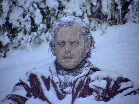
Anyone who’s seen the movie will remember the ending, which transitions from a lengthy chase sequence in the snowy hedge maze to a modified zoom shot that reveals the existence of Jack Torrance, played by Jack Nicholson, in a banquet decades earlier.

But the first audiences experienced a very different ending of the movie. Between those two shots was an entire scene that Kubrick cut from the movie after audiences in New York City and Los Angeles had seen it, as Lee Unkrich of The Overlook Hotel website describes:
 

Kubrick decided to remove the scene very shortly after the U.S. opening, dispatching assistants to excise the scene from the dozens of prints showing in Los Angeles and New York City. All known copies of the scene were reportedly destroyed, although it is rumored that one surviving copy may exist.

 
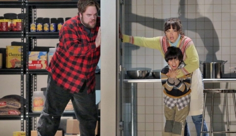
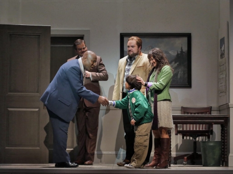
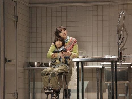
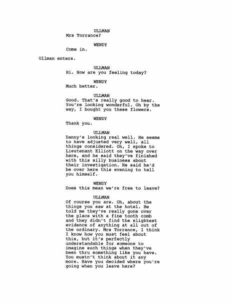
In the scene, which takes place a few weeks after the final chase, Ullman, the hotel manager we meet at the start of the movie, visits Danny and Wendy in the hospital where both are recovering. The significant thing here is that audiences get a chance to see that the two of them are OK, a reassurance denied most of the people who’ve watched the movie since then. Ullman explains to Wendy that investigators have not been able to uncover the slightest evidence of anything supernatural in the hotel. Before he leaves, according to the script, Ullman tosses Danny a “yellow ball,” presumably the same ball that was rolled to him from an unseen force outside Room 237 about halfway through the movie.

Diane Johnson, who co-wrote the movie with Kubrick, recently commented: “In other words: All of this really happened, and the magic events were actual. It was just a little twist. It was easy to jettison.”

The scene was cut on a suggestion from Warners, which felt that it was too confusing. Kubrick complied with the request. Here’s Harlan’s take:
 

The tennis ball is the same thing as the photograph — it’s unexplainable. It makes Ullman now another ghost element. Was he the ghost from the very beginning? The film is complex enough because nothing is explained. That non-explaining is what was bad for the film initially. It was not a huge success. Now everybody thinks it’s the best horror film ever or whatever. But when it came out the audience expected a horror film with a resolution, with an explanation. Who is the baddie? What was going on? And they were disappointed — many of them, anyway. The fact they were left puzzled was exactly what Stanley Kubrick wanted. And when the film [screened for critics] and wasn’t well received, Warners quite rightly suggested, “It’s enough, just take [the hospital scene] out.” So Stanley did it. He’s not stubborn, especially since this is a film mainly to entertain people. But Stanley was actually very sad that he misread the audience, that he trusted the audience to live with puzzles and no answers, and that they didn’t like it.

 
Personally, I think the scene was removed because audiences hadn’t had the first ball emphasized enough for them to realize the implications of Ullman having the same ball with him (and therefore being a ghost or something). After all, Torrance spends a lot of time throwing a ball against the banquet room wall, too. That meaning implied by the ball was too weak for the requisite “Aha!” moment to register; that would have required dialogue about the ball (“But where did the ball come from, Danny?”) or perhaps repeated instances of mysterious events related to the ball, as of way of lodging it in the audience’s memory.

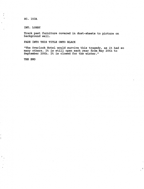
Less commented upon was the apparent inclusion, at least at the script stage, of a lame caption before the end credits:
 

The Overlook Hotel would survive this tragedy, as it had so many others. It is still open each year from May 20th to September 20th. It is closed for the winter.


I think all observers can agree that it was good that that isn’t in the surviving version…...

Here are the script pages for the deleted scene:


Previously on Dangerous Minds:
‘The Shining’ in the style of an 8-bit video game
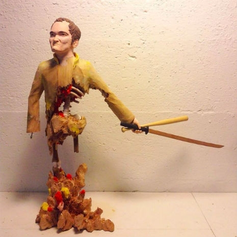
Frozen ‘Jack Torrance’ from ‘The Shining’ Halloween costume

Posted by Martin Schneider
|
04.13.2017
04:04 pm
|
The opera based on Stephen King’s ‘The Shining’
04.12.2017
03:05 pm
Topics:
Tags:


Last year the Minnesota Opera showcased the world premiere of a new opera based on Stephen King’s famous novel The Shining, the starting point for an unsettling adaptation by Stanley Kubrick starring Jack Nicholson and Shelley Duvall. 

The operatic version was composed by Paul Moravec with a libretto by Mark Campbell. Moravec won the Pulitzer Prize for Music in 2004 for his work Tempest Fantasy.

The opera is an adaptation not of Kubrick’s movie but of King’s book—although the movie, firmly embedded in the minds of virtually everyone in the audience, will surely have an effect. As an example, the famous words “Here’s Johnny!,” shouted by Nicholson’s Jack Torrance in a moment of frenzy, is not in the novel and thus does not appear in the opera either. King has never had any affection for Kubrick’s version of his novel, so it’s noteworthy that the prolific author “maintained libretto approval and gave Campbell the green light 24 hours after receiving the final version.”

The Shining capped off the Minnesota Opera’s 2015-2016 season, with the premiere taking place on May 7, 2016.

The reviews have been respectful to more than respectful. In the magazine Opera News, Joshua Rosenblum was effusive about the production, saying that “Moravec proves to be a masterful musical dramatist.” He added that “Brian Mulligan does the seemingly impossible—he actually makes you forget Jack Nicholson” and that “watching Vega’s Danny step slowly toward the bathtub with the drawn curtain in the forbidden room 217 was as riveting as anything I’ve ever seen in a theater. “

Fun fact: Rosenblum did not mistype Room 237, nor did the librettist commit a flub—in King’s novel the locus of dread is actually Room 217.


More after the jump…

READ ON
Posted by Martin Schneider
|
04.12.2017
03:05 pm
|
Real Horrorshow: The short-lived ‘Clockwork Orange’-themed punk band Molodoy


I’m pleased to have a reason to call attention to the Sheffield Tape Archive, an absolutely unbeatable resource helping to preserve an essential part of our collective musical heritage. As they describe it, the archive’s purpose is to house “a series of archive recordings from around 1980 onwards: sheffield bands, demos, concerts and rarities.”

One of the more intriguing acts featured in the Sheffield Tape Archive existed only very briefly, never put out an album, and their only live dates were before 1980. They were called Molodoy, and they had a terrific gimmick: The entire band was an extended homage to the joint artistic labors of Anthony Burgess and Stanley Kubrick, the latter of course having most memorably adapted the former’s unsettling bestseller A Clockwork Orange. Not much is known about this band today, but I’m willing to bet that one rejected name for the band was Alex and the Droogs.

The group’s singer, Garry Warburton, unmistakably played the role of Alex, complete with facepaint incorporating the book’s signature gear/eye motif (as you can see above) that also references the extravagant eyelash makeup worn by Malcolm McDowell in the movie.


The name, Molodoy, comes from the book, which is told in an invention of Burgess’ called “Nadsat,” a type of youth slang that is replete with Russian-derived colloquialisms—the best-known term is “horrorshow,” which is a reformulation of khorosho, the Russian word for “good.” The term molodoy, meaning “young,” pops up early in Burgess’ novel:
 

I nudged him hard, saying: “Come, my gloopy bastard as thou art. Think thou not on them. There’ll be life like down here most likely, with some getting knifed and others doing the knifing. And now, with the nochy still molodoy, let us be on our way, O my brothers.”

 
Molodoy unfortunately didn’t leave much trace behind. I was able to find an account of a Cabaret Voltaire gig at Sheffield’s Limit Club from the summer of 1978 at which Molodoy also played. The writer, whose name I was not able to ascertain, seems to have found them more than a little intimidating:
 

Molodoy follow. This is the band the skinheads have come to see. The singer is dressed in full Clockwork Orange droog uniform: black bowler hat, eye make-up, white shirt and trousers, black boots and braces. Real horrowshow.

“This one’s called ‘Children Of The Third Reich’”.

The lyrics flirt with fascism. The music is taut, dense and sexless. He’s watchable in a detestable kind of way. The skins push each other around, there is argy, but thankfully no bargy. The rest of us look on, mute. We are either young, liberal-minded types who think everyone is entitled to their own point of view, or we are collectively shit scared of getting a 14 eye oxblood Dr. Martens boot to the head. Molodoy continue to thrash and thrum, we the audience opt to keep schtum.

 
To perform in a rock group dressed as a Droog in 70s Britain was to, obviously, assume the mantle not just of “ultra-violence,” but of sexual violence as well. After Fleet Street blamed the film for inspiring a gang rape in which the attackers sang “Singin’ in the Rain” as “Singin’ in the Rape” and A Clockwork Orange was linked to several sensational murders, Kubrick’s film was withdrawn from distribution in 1973 at the director’s request. No wonder the bootboys came out in force for Molodoy.

More after the jump…

READ ON
Posted by Martin Schneider
|
03.23.2017
12:27 pm
|
‘2001: A Space Odyssey’ by Jack Kirby


If you’re at all aware of comic books history, Jack Kirby needs no introduction. As one of the founding visionaries at Marvel in the 1960s, Kirby’s vital storytelling skills and phenomenal visual energy helped make the X-Men, the Hulk, and the Fantastic Four household names.   

A few months ago we drew your attention to a never-published project of Kirby’s, his adaptation of The Prisoner, the dystopic British TV series starring and co-created by Patrick McGoohan. Today we have a similar treat, one of the very few fully realized stories by Kirby that has never been collected in book form—his mid-1970s adaptation of 2001: A Space Odyssey, originally a short story by Arthur C. Clarke called “The Sentinel” and later a movie directed by Stanley Kubrick.

The movie came out in 1968, but Kirby’s adaptation had to wait until 1976. We can regard that gap as a kind of marker for Kirby’s strong desire to adapt the story even though there may have been little commercial interest in it. Kirby first adapted the movie as a standalone book of 70 pages, and then proceeded to recapitulate the movie’s plot and themes over and over again across 10 issues—except this time with scary aliens with tentacles that have nothing to do with Kubrick’s movie. The resolution of that 10-issue run is a character who is actually oddly resonant with our own times, a human-A.I. hybrid called Machine Man, whose own comic book line, which picked up where 2001: A Space Odyssey left off, lasted for a few months. The character would be fitfully resurrected every ten years or so (1984, 1999). 

Remarkably, Machine Man was eventually made a part of the Avengers, so it’s an accurate statement to say that the Avengers has the DNA of Kubrick and Clarke in it—and for that matter Friedrich Nietzsche, who is never far from my thoughts whenever I watch Kubrick’s masterpiece.


Kirby’s adaptation of the movie was wildly rethought for the medium of comics. His palette is all over the place, departing vastly from Kubrick’s more stately blacks, whites, and reds. And the action of course is tuned to the entertainment value of a typical 10-year-old rather than a stoned college student—this is echoed in the cover promise that “The Ultimate Trip” would become “The Ultimate Illustrated Adventure!” Kirby dispenses with the three (highly Nietzschean) sections of the movie (“The Dawn of Man,” “Mission to Jupiter,” and “Jupiter and Beyond the Infinite”) with four more hyperbolic sections of his own, which are replete with exclamation points:
 

Part I: The Saga of Moonwatcher the Man-Ape!
Part II: Year 2001: The Thing on the Moon!
Part III: Ahead Lie the Planets
Part IV: The Dimension Trip!

 
Kirby’s fans are said not to be fond of his 2001: A Space Odyssey, but I must say I like it. It’s got not that much to do with Kubrick but that just makes it all the more interesting.

In Kirby’s telling, the so-called “Starchild” infant of the movie’s finale is reconcieved as “The New Seed.” In the feature hilariously called “Monolith Mail” reserved for reader correspondence, Kirby noted of this element:
 

The New Seed is the conquering hero in this latest Marvel drama. Why? Because he has staying power, that’s why. He will always be there in the story’s final moments to taunt us with the question we shall never answer. The little shaver is, perhaps, the embodiment of our own hopes in a world which daily makes us more than a bit uneasy about the future ... in the meager space devoted to his appearance, he brightens our hopes considerably. He is a comforting visual, almost tangible reminder that the future is not yet up for grabs. And wherever his journey takes him matters not one whit to this writer. The mere fact that the chances of his making it are still good is the comforting thought.

 
Some sample images from Kirby’s 2001: A Space Odyssey:


More images from Kirby’s 2001: A Space Odyssey after the jump:

READ ON
Posted by Martin Schneider
|
03.20.2017
12:19 pm
|
Score this cool ‘Shining’-themed skirt while it’s dirt cheap
02.22.2017
07:33 am
Topics:
Tags:


There’s this intriguing skirt that’s a perfect item for the woman who loves The Shining, Stanley Kubrick’s endlessly compelling 1979 Stephen King adaptation, but doesn’t always want to be too obvious about it. I noticed it at a bar yesterday when I witnessed one woman pay another a sartorial compliment for wearing it. The wearer instantly mentioned that it depicts part of the helicopter shot from the opening sequence of The Shining.

This got my attention, so I inquired further. As fans of the movie will remember, the opening sequence is a lengthy series of shots of a fantastic natural landscape, most of it a bird’s-eye view of a car driving on a road. But the car isn’t in the very first shot; the very first shot was executed over a body of water, a landscape shot taken at Saint Mary Lake in Glacier National Park, Montana. 

Here’s a basic shot of the skirt:

 
Here’s a closer look:

 
Here’s a picture of the very first shot of The Shining:

 
It sure as heckfire seems like the same place from the same angle. You can even see a slight irregularity on the base of the mountain on the right side of the picture, it’s the same in both pictures. They’ve fucked with the colors a bit and given the setting much more of a radioactive neon feel, but it’s the same place. 

More after the jump…

READ ON
Posted by Martin Schneider
|
02.22.2017
07:33 am
|
Classic Penguin sci-fi covers from the 1970s by David Pelham


Night of Light by Philip José Farmer
 
David Pelham was art director for Penguin Books during the 1970s and was responsible for a great many arresting and distinctive covers for many of the sci-fi novels Penguin put out during that time, which is one of the great periods for sci-fi writing in general. Many of the images on this page come from a series that came out in 1972-73 that used (as Penguin often did and still does) visual cues to signal that books belong together. In this case the series had in common white text and a black background, bold use of primary colors and a strong horizon line that in some cases (Sirius, A Cure for Cancer) is cleverly adapted for a slightly different purpose.

Pelham did many Penguin covers for works by J.G. Ballard and was in close contact with the author in the process of creating them. Ballard actually named a character in “The Reptile Enclosure” after Pelham. After one meeting during which they had looked over Pelham’s mockups for a series of Ballard covers, Pelham scribbled some notes that were obviously based on Ballard’s comments, and they make for a resonant and Ballardian piece of poetry: “monumental / tombstones / airless thermonuclear landscape / horizons / a zone devoid of time.”

Pelham’s most famous cover was for Anthony Burgess’ A Clockwork Orange, and fascinatingly enough, Pelham himself doesn’t think much of it:
 

When I was Art Director of Penguin Books I had to create this image in one night. We planned to bring out a film tie-in of Burgess’s wonderful book to coincide with the release of the movie, and we obviously urgently needed a strong cover image that related to the film. When Stanley Kubrick unaccountably refused to supply us with promotional press shots I immediately commissioned a well-known illustrator to help out. The result was not only unacceptable but it was also inexcusably late, so we were horribly out of time. Having already attended a press screening of Kubrick’s film I had a very clear image in my mind’s eye as to how the cover should look and so, collecting up a few supplies from the art department, I sped home to my Highgate flat to create the cover myself. I remember a motorcycle messenger arriving at 4.30am to deliver the ‘repro’—that is the typography—for the paste up. This of course was a long time before the age of computers, and everything was done with ink, glue and ‘repro’, which had to be painstakingly stuck in place on a base board. Another messenger arrived at 7am to whisk the artwork off to the printer. Consequently I had not had time to properly scrutinize the image, to make the small adjustments and refinements that I still believe it needed. So now, every time I see that image, all I see are the mistakes. But then, maybe it’s those unfinished rough edges that contribute to its appeal. Who knows?

 
In 1996 Eye Magazine wrote that Pelham’s covers “dignify the books with symbolic images that help to convey the conceptual sophistication of the writing inside.” For more of Pelham’s covers as well as many striking Penguin covers by other artists, check out the well-curated website Penguin Science Fiction.
 

A Clockwork Orange by Anthony Burgess
 

Cat’s Cradle by Kurt Vonnegut
 
Many more of Pelham’s spectacular sci-fi creations after the jump…..

READ ON
Posted by Martin Schneider
|
08.19.2016
02:34 am
|
‘Funeral Parade of Roses’: Edgy 1969 Japanese drama that inspired Kubrick’s ‘A Clockwork Orange’
06.15.2016
02:09 pm
Topics:
Tags:


Toshio Matsumoto’s Funeral Parade of Roses is one of the most audacious and astounding feature films ever made, a visually-stunning hodgepodge of cutting edge 60s graphic design, Warholian underground cinema, documentary filmmaking along with wildly experimental editing techniques. Matsumoto’s dazzling freewheeling filmmaking breaks the Brechtian fourth wall several times—interviewing the actors about their roles and pulling a shot out to reveal the camera and lighting crew—and shows the influence of William Klein’s fashionista extravaganza Who Are You, Polly Magoo?, the films of Jean Luc Godard and Alain Resnais, even Alfred Hitchcock’s Psycho.


Funeral Parade of Roses is a furious and dizzying bombardment of violence, sex, and drugs. The 1969 film is well-known to have been a major influence on Stanley Kubrick’s adaptation of A Clockwork Orange, and we see this in the sped-up montage scenes set to classical music, the sound design and editing style, and art direction (not to mention the false-eyelashes and the phallic lollipops). It was produced via the Art Theatre Guild (ATG) the legendary Japanese production company and distributors of the country’s “New Wave” cinema that was shunned by the major studios. In one underground “in-joke” New York’s avant-garde cinema promoter Jonas Mekas is mentioned by name and quoted:

“All definitions of cinema have been erased. The doors are now open.”


All this and I’ve yet to mention that Funeral Parade of Roses takes place in Tokyo’s gay underworld—Bara no sôretsu is the original Japanese title, “bara” meaning “rose” which equates to the pejorative use of “pansy”—giving it a particularly edgy reputation for a film made in Japan in 1969.


More after the jump…

READ ON
Posted by Richard Metzger
|
06.15.2016
02:09 pm
|
‘2001: A Space Odyssey’ in the style of Picasso


A team of developers named Gatys, Ecker, and Bethge recently developed an implementation of a technique known as a “style transfer,” which involves taking a specific pattern and “applying” it to a piece of video, such that the available surfaces in the video take on the texture of the original pattern. It’s kind of like a face swap only more ambitious.

A few months have passed, and a clever individual named Joshi Bhautik has tried to apply the technique as a way of mashing up great art and classic cinema. Specifically, he took a painting by Pablo Picasso, one of his “Les Femmes d’Alger” (Women of Algiers) series, which looks like this:


... and used it as the base image for a deep neural net-based style transfer on Stanley Kubrick’s masterpiece 2001: A Space Odyssey, which is full of striking images to say the least.

Once you do that, the generally stately, slow cinematography of the movie becomes a shimmering kaleidoscope, as seen in the following image:


The method has the peculiar effect of turning the entire movie into a version of the phantasmagorical, psychedelic journey Dave Bowman goes on for several minutes at the end of the movie, a sequence MAD magazine once compared to “crashing through the brand-new 105-story Jupiter Museum of Op Art.”

Here’s Bhautik’s description of what this is:
 

‘2001: A Space Odyssey’ rendered in the style of Picasso using deep neural network based style transfer. The cubist style had mixed results in the transfer; you can see that big empty blocks of colour didn’t map coherently between the frames. I’m working on a solution for that :]

 
See it after the jump…

READ ON
Posted by Martin Schneider
|
06.09.2016
01:30 pm
|
Amazing movie posters for films by Hitchcock, Kubrick and Lynch that we’ll never get to see

fro-design-company23.jpg
Salvador Dali’s ‘Giraffes on Horseback Salad’ (1937)
 
Most film directors have a list of movie projects they never manage to make. Some are started like Orson Welles’ Don Quixote but never finished—though posthumously released in a re-edited form. Others like Hitchcock’s R.R.R.R. never quite make it from idea to script to studio green light.

L.A. based artist and designer Fernando Reza has created a stupendous selection of film posters for movie projects by directors like Hitchcock, Welles, Stanley Kubrick, David Lynch and even Salvador Dali that were discussed, planned, and even partially filmed but never completed.

Take for example Salvador Dali who planned to make a movie with the Marx Brothers called Giraffes on Horseback Salad in 1937. Dali was friends with Harpo Marx and the pair decided to work together on a film project. Dali had already made two short films with Luis Bunuel (Un Chien Andalou and L’Age d’or) and would later go on to collaborate with Walt Disney and Alfred Hitchcock designing dream sequences for Dumbo and Spellbound.

Dali and Marx concocted a story about an aristocrat played by Harpo falling in love with a woman whose face is never revealed. The great Surrealist intended to use the film to show:

...the continuous struggle between the imaginative life as depicted in the old myths and the practical and rational life of contemporary society.

The film was to include scenes with a “horde of burning giraffes wearing gas masks, and Harpo catching dwarves with a net.” A script was apparently written but the other Marx Brothers nixed the idea thinking the idea a stinker and the script not very funny.
 
fro-design-company26.jpg
Alfred Hitchcock’s ‘Kaleidoscope’ aka ‘Frenzy’ (1964-67).
 
Alfred Hitchcock wanted to make a prequel to Shadow of Doubt with another “Merry Widow Murderer” luring women to their grisly deaths. As with Psycho, Hitchcock had devised three set pieces to focus on the three gruesome murders carried out by the deviant sex-fiend. The first murder was to take place by a waterfall; the second on board a disused warship; the third in an oil refinery against brightly colored oil drums. 

Unlike Psycho or Shadow of Doubt there was no moral counterpoint to the “relentless sex and violence” shown onscreen. A script was written and test scenes shot. Among the actors considered for the lead role were Michael Caine, Robert Redford and David Hemmings. The film was basically a slasher movie a decade ahead of its time. Universal Studios vetoed the idea—thinking Hitchcock’s movie too amoral and too dark.
 
Continues after the jump…

READ ON
Posted by Paul Gallagher
|
06.06.2016
11:06 am
|
Fantastic wooden sculptures of famous movie directors


Stanley Kubrick
 
I like these mash-up wooden sculptures of Hollywood film directors by artist Mike Leavitt. If you notice, each sculpture references movies the director made. The directors are in the details i.e. Stanley Kubrick’s eyelashes referencing A Clockwork Orange or Hitchcock carved as a bird. 

Each sculpture measures around 18 inches in height. Now as to whether or not these are for sale… I simply don’t know. You can contact Mike Leavitt at his site here to find out. You can also follow Leavitt on his Instagram to see his work in progress. 


Alfred Hitchcock
 

An unfinished Quentin Tarantino
 
More after the jump…
 

READ ON
Posted by Tara McGinley
|
05.13.2016
12:05 pm
|
Page 1 of 5  1 2 3 >  Last ›