FOLLOW US ON:
GET THE NEWSLETTER
CONTACT US
Banana: After 50 years the ultimate Warhol Velvet Underground mystery is finally (almost) solved!!

ufghdrtb
 
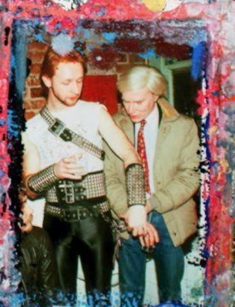
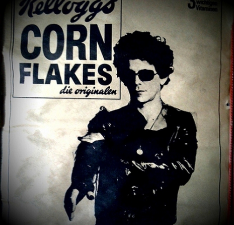
I awoke this morning to the extremely sad news that our friend Howie Pyro had passed. The rocker, cultural historian, DJ, founding member of D-Generation, bass player in Danzig, and frequent Dangerous Minds contributor, had a liver transplant last year, but then sadly caught COVID just when everything seemed like it was on a (TBH very unexpected) upswing in his health. I was just thinking about him yesterday and made a mental note to write and wish him well. Then this.

Although I don’t think anyone would have mistaken Howie for an angel—he wouldn’t have needed a liver transplant if he had been—everyone who knew him loved him, because he was just such a sweet man. Not that many people can be said to have been universally loved in their time, but I think it’s true of Howie. The first word that comes to mind to describe him is sweet. He was really sweet and kind and generous. Extra extra, you know?

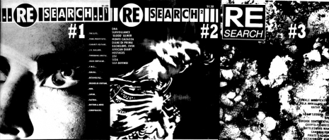
Howie was also one of the world’s all time great rock-n-roll collectors. OH MY GOD was his collection amazing. Nothing else like it has ever been put together, anywhere in the world, I can say without hesitation. While Howie might have (quite reasonably!) appeared to be a hoarder—this stuff was EVERYWHERE, the kitchen the bathrooms, EVERYWHERE, and there were little pathways so you could walk through—it was all nearly Smithsonian Institute level items! Getting a personal tour was an astonishing show. The weirdest records (lots of rockabilly), hundreds of shoulder-high stacks of magazines and newspapers, memorabilia of every variety, as many times as I was there, I never saw more than the tiniest tip of a very, very big iceberg, but a few things stood out.

One of them was his collection of Andy Milligan movie posters. He owned ALL OF THEM, from all over the world. I mentioned Milligan casually—as one does—and out came several folders (only the movie posters were organized) that blew my mind. Another was something that he’d recently acquired, a small black lithographed poster on card, brushed with actual diamond dust, advertising a 1971 benefit show at the Hollywood Palladium (which never took place) with, get this—The Stooges, the GTOs, John Mendelssohn-Super Star, and the Cockettes! At one point we were standing in his stuffed to the gills kitchen and there was a two foot high stack of faded green newsletters from the late 1950s/early 1960s—crudely produced on an old fashioned mimeograph machine perched next to the sink. The modest publication turned out to be these one to three page listings of Southern California-based establishments that were gay-friendly at a time when gay bars were still being busted and the patrons hauled away in police vans. He’d found this dumpster diving in Palm Springs. Clearly the anonymous person who published this newsletter—which contained other items that would have been of interest to gay men, like recommending gay-friendly doctors and VD clinics—had been doing so for many, many years, as the height of this stack testified to. I couldn’t believe what I was looking at. How many other things like this existed that have been lost to the sands of time and basement flooding?

But the best thing of all, in a collection with literally hundreds of thousands of amazing and astonishing items, was his banana ashtray, but I’ll tell Howie tell you the story himself, in this Dangerous Minds post from 2017. RIP Howie Pyro, you will be missed.

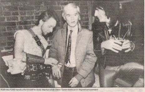
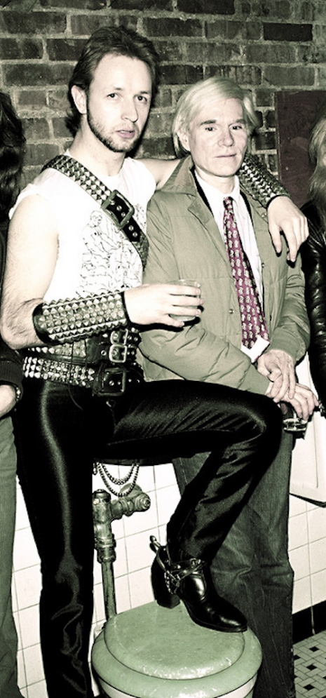
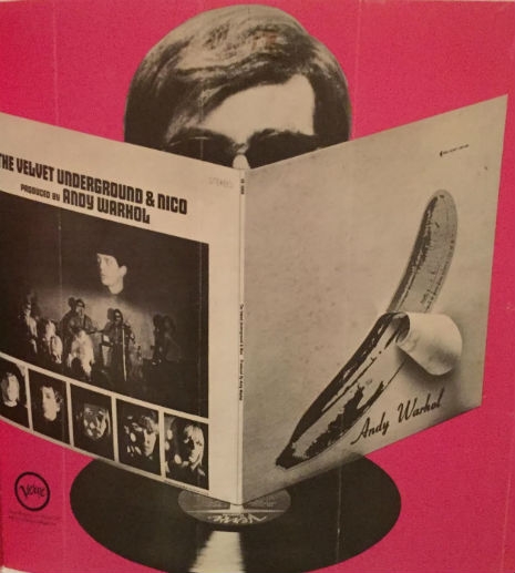
It was fifty years ago this week that the future began with the Velvet Underground, Andy Warhol, and his banana. The destruction and rebuilding of rock ‘n’ roll music as it then existed commenced. This was all taking place even though only a few people knew about it at the time. The right few, as always. I have to think that anyone reading this knows the history of the Velvet Underground so I’m not going to rehash it here.

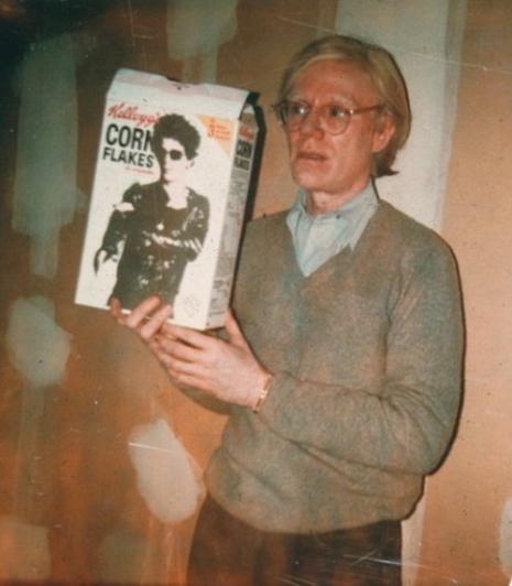
In the thirty years since Warhol’s death, the human race has bought and sold more “Andy” than Andy himself could possibly have dreamed of and more. Much more. Too much even. Year after year there are more Warhol books, toys, giant banana pillows, clothing lines, shoes, Andy Warhol glasses, movies, action figures (or maybe inaction figures, this being Warhol), pencils, notebooks, skateboards—literally everything ever! There’s been more most post mortem Warhol merchandising than for practically anyone or anything you can name. These days, probably even more than for Elvis, Marilyn or James Dean who had head starts.

Warhol and his entourage were infamous speedfreaks—speedfreaks with cameras, tape recorders, and movie gear who talked a lot and didn’t sleep much—and his every utterance was recorded, long before museums, historical posterity and millions of dollars were the reasons.

With the advent of the Warhol Museum, Andy’s every movement, thought, and influence has been discussed, dissected, filed and defiled ad nauseum. Every single piece of art he ever did can be traced back to an original page in a newspaper, an ad in the back of a dirty magazine, a photograph, a Sunday comic, or an item from a supermarket shelf and they’ve ALL been identified and cataloged.

Except for one.

Just one.

Probably the second most popular of Warhol’s images, standing in line right behind the Campbell’s soup can, is the banana image found on the cover of the first Velvet Underground album. Thee banana! But where did it come from? Everything else was appropriated from somewhere. What about this one?

I KNOW where it came from and I have known for around thirty years. Oddly enough it only just now occurred to me (when I looked up Warhol’s death date) that I found this thing, which I am about to describe, mere weeks before Andy’s untimely demise.
 
ggnhlubfd
 
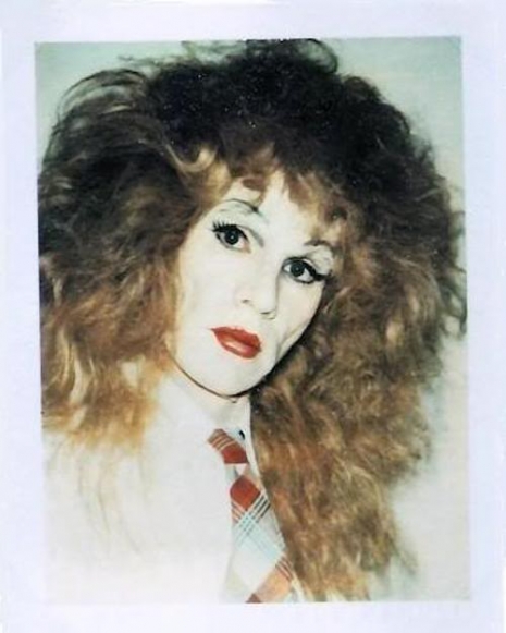
I grew up in the sixties and I’ve loved the Velvet Underground since even before the advent of punk. And I love Andy Warhol, too. Just look at my Facebook profile photo. I have shelves of books on Warhol and all things Velvets and have amassed quite a collection of Warhol and Velvets rarities. My favorite book of all time is Andy Warhol’s Index from 1966, a children’s pop-up book filled with drag queens, the Velvets, 3-D soup cans and even a Flexi disc record with Lou Reed’s face on it with a recording of the Velvet Underground listening to a test pressing of their first LP. The one with the BANANA.
 
dvbjcdg
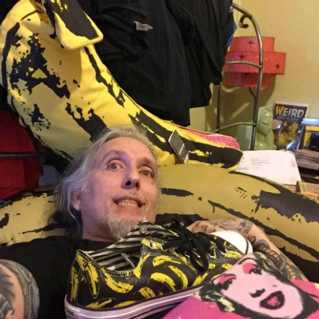
The author’s Facebook profile pic. Duh.
 
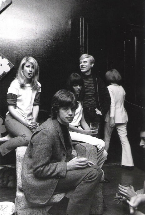
Andy Warhol’s number one right-hand man in the sixties and the person who turned the Factory silver (among many many other things including being the primary photographer of the Factory’s “silver years”) was Billy Name (Linich). An online comment described him this way:

You can’t get more inside than Billy Name in Warhol’s Factory world. In fact he lived in the Factory - and to be more specific he lived in the bathroom at the Factory - and to be even more specific he stayed in the locked bathroom without coming out for months (years?).

 
And so to quote this definitive “insider” Billy Name on the history of the banana:

...bananas had been a Warhol theme earlier in the Mario Montez feature film Harlot mostly as a comedic phallic symbol. In the general hip culture, Donovan’s “Mellow Yellow” was going on [mellow yellow; roast banana peels in an oven, and then roll and smoke them]. The high was called “mello yellow.”

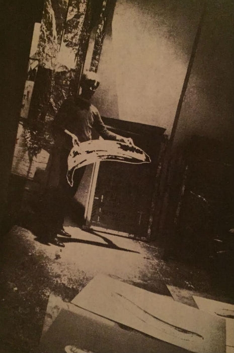
The specific banana image Andy chose came from I know not where; it’s not a Chiquita banana or Dole fruit company, because Andy’s banana has ‘overripe’ markings on it, and the fruit companies use whole yellow bananas on their stickers. Anyway, Andy first used this particular banana image for a series of silk-screen prints which he screened on white, opaque, flexible, Plexiglass (sort of like 2 feet x 5 feet). First an image of the inner banana “meat” was screened on the Plexi in pink, and then covered by the outer skin screened on and cut out of a glossy yellow sticky-back roll of heavy commercial paper (ordered from some supply warehouse). Thereby each banana could be peeled and the meat exposed and the skin could be replaced a number of times, ‘til the sticky stuff wore out. Naturally this was intentionally erotic Warhol-type art.

When thinking of a cover for the first Velvets album, it was easy for Andy to put one of his own works on the cover, knowing it was hip, outrageous, and original and would be “really great.” Andy always went the easy way, using what he had, rather than puzzling and mulling over some design elements and graphics for cover art that don’t really work. His art was already there, hip, erotic, and cool. The Plexi silk screen art definitely came first, in 1966. The album came out in ‘67. I do not recall any other design being thought of or even considered. The back of the album cover was a pastiche amalgam of photos from Andy’s films, Steven Shore, Paul Morrissey and myself and was messy and mulled over too much.

 
xfcgdvyjervs
 
So here we are on the fiftieth anniversary of The Velvet Underground & Nico and its mysterious banana cover art, and I felt that I have held this secret for way too long. I always wanted to use this in a book or something but it never happened.

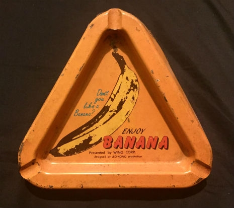
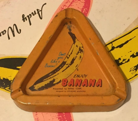
This thing was hanging on my kitchen wall for three decades, in New York and LA and is now in secured storage for reasons which are about to become obvious. This is how I found it: One day in the mid 80s I was cruising around the Lower East Side aimlessly—as I had done most of my life up to that point—running into friends, looking at stuff people were selling on the street, stopping into Manic Panic, Venus Records, St. Marks Books, and any junk shops that caught my eye. There was one on Broadway that I had never seen before right down the street from Forbidden Planet and the greatest place ever, the mighty Strand Book Store. I went in and there was a lot of great stuff for me. I found some old records, a huge stash of outrageous and disgusting tabloid newspapers from the sixties which I kept buying there for a couple months afterward, and some cool old knick-knacks. I knocked into something on a crowded table full of junk and heard a big CLANG on the cement floor. I bent down to pick it up. It was one of those cheap triangular tin ashtrays that usually advertised car tires or something mundane. I picked it up (it was face down) and when I turned it over I was surprised to see…THE BANANA!!

It was an ad for bananas printed on a cheap metal ashtray.
 

Don’t you like a banana? ENJOY BANANA. Presented by WING CORP. designed by LEO KONO production”

 
I thought wow, this is cool! But over time I realized that I had quite literally stumbled across a true missing link. I figured I’d use it for something big one day, but I never did. UNTIL NOW. Ladies and germs, Andy Warhol and Velvet Underground fans and scholars, without further ado I bring you THE MISSING LINK! A true Dangerous Minds mega exclusive! (As Jeb Bush would say “Please clap.”).

A primitive, pounding Moe Tucker drumroll please for the reveal of THEE BANANA…
 
fgkhtgjrfu
 
Absolutely bananas, right?

I figured by now that there’d be at least some sort of information on this out there, as I honestly I haven’t looked in ages. But when I was reminded of the fiftieth anniversary of the album being released this past “Sunday Morning,” and took that silly Facebook profile picture it dawned on me. THE BANANA ASHTRAY, my own unique piece of Warhol and Velvets history!!! I spent two or three hours really scouring the Internet yesterday and there isn’t one word about it. No “banana ashtray.” No “Wing Corp,” no “Leo Kono production,” either. Nothing!

So now that I, Howie Pyro, have released this top secret banana, I hope all of you mellow yellow types out there in your yellow velvet uniforms go wild seeking out the info we need! So all you femme fatales, skip one of all tomorrow’s parties and run run run to find some heroin for all your European sons while waiting for your banana man, man.

Stay mellow, stay yellow and don’t slip on any banana peels (slowly, see?). Over and out. Warhol Museum, you know how to reach me…

(To read the comments left on the original post, go here.)
 
fdgukyotiydfs
 

Enjoy an early classic Warhol film ‘Harlot’ (aka ‘Mario Banana’) starring that icon of perversion Jack Smith and Mario Montez.

Posted by Richard Metzger
|
05.05.2022
07:21 am
|
Pop Will Eat Itself: FX Master Tom Savini transforms Andy Warhol into a zombie, 1985
12.17.2019
08:39 am
Topics:
Tags:


Tom Savini and Andy Warhol. All photos by Christopher Makos via Pittsburgh City Paper.
 
Before Tom Savini made Andy Warhol look like a character from one of George Romero’s films, he had never met the soft-spoken artist. However, his actor/makeup artist/stuntman younger brother Joe Savini had attended school with Warhol at Carnegie Institute of Technology (now Carnegie Mellon University) in Pittsburgh. George Romero is also an alumnus of the school. Following the release of Day of the Dead in 1985, Savini would receive a call on behalf of Andy Warhol requesting that he transform Andy into one of his iconic zombies. Given the fact that Pittsburgh is truly the center of the zombie universe, as well as the birthplace of Andy Warhol and Tom Savini, the pop artist’s request to become a zombie was perhaps inevitable. Whatever the case may be, Savini and long-time colleague FX legend Greg Nicotero traveled to meet Warhol in New York to make Andy’s dream of becoming one of the undead a reality.

During their time with Warhol, the platinum-wigged artist sat quietly while Savini and Nicotero worked their magic. Also on hand was Massachusetts native, photographer (and former apprentice to Man Ray) Christopher Makos, who captured a few moments from the threesome’s strange get-together. According to Savini, he himself was unaware Warhol was wearing a wig and gently tried to adjust Andy’s “hair.”
 

Zombie Warhol.
 
It turns out Andy Warhol was very much a fan of Romero’s Living Dead series and zombie culture. In an interview with the Pittsburgh City Paper, Makos, a close friend of the artist, believed Romero’s films—and others like them—were a part of the artist’s “fieldhouse” (though he likely meant “wheelhouse”). Warhol’s 1977 film Bad features a gory scene of a woman tossing her crying infant out of a window. It splatters on the sidewalk next to a woman walking by, spraying blood from its head.

Another aspect of Romero’s films that appealed to Warhol was how the filmmaker was able to make such a strong statement with a relatively small budget. In the case of 1985’s Day of the Dead, Romero saw his initial budget of seven million slashed in half. This forced Romero to make huge concessions not only to the original script and larger scale of the film, but his desire for Day of the Dead to be unrated. If you’re a fan of this film, the reality of the drastic cuts ended up producing some of the greatest practical effects ever, as well as the gift of another Massachusetts native, Joseph Pilato (RIP) in the unforgettable role of Captain Henry—“Choke on ‘em!”—Rhodes, who only got the part as a direct result of the reduction in the film’s budget.

Makos’ photographic legacy is astounding in its own right, and his many images of Andy Warhol can be found in his beautiful books on Andy. Tom Savini has recently released his highly anticipated autobiography, Savini: The Biography.
 

An alternate image of Warhol as a Savini zombie.
 

The trailer for Andy Warhol’s ‘Bad.’

Previously on Dangerous Minds:
Andy Warhol interviews Frank Zappa (whom he hated) without uttering a word
Andy Warhol meets the Cars: The notorious NSFW ‘nude’ version of the ‘Hello Again’ video
Oh, you pretty thing! Polaroid portraits of Andy Warhol in drag
The Andy Warhol episode of ‘The Love Boat’

Posted by Cherrybomb
|
12.17.2019
08:39 am
|
David Cronenberg on Andy Warhol
09.20.2018
05:49 am
Topics:
Tags:


The soundtrack CD from the Art Gallery of Ontario show
 
In between A History of Violence and Eastern Promises, David Cronenberg curated a Warhol retrospective at the Art Gallery of Ontario. ANDY WARHOL/SUPERNOVA: Stars, Deaths and Disasters, 1962–1964, a selection of work from Warhol’s first years at the Factory, also appeared at the Walker Art Center in Minneapolis and the Museum of Contemporary Art in Chicago, but the AGO show was special in at least two respects.

Only the Toronto iteration of the show presented Warhol’s death and celebrity paintings alongside his early films. For instance, Cronenberg set Silver Disaster #6, Warhol’s silkscreened image of two electric chairs, in the middle of a triptych, looping the movies Kiss and Blow Job on either side. The director also recorded a soundtrack for the exhibition which he narrated himself, splicing in contributions from Dennis Hopper, Amy Taubin, James Rosenquist, and Mary-Lou Green. In a masterstroke, Cronenberg included Elvis’ recording of the title song from Flaming Star on the soundtrack; as he pointed out at the time, the Don Siegel movie that was the source for Warhol’s Elvis I and II is “about racism, and everyone dies in it, including Elvis.”

Recall that the brilliant explosion characteristic of a supernova is the moment of a star’s death. With its Ballardian preoccupations, the show might as well have been called Death Drive. Fittingly, the Guardian marked the fifth anniversary of 9/11 by running an interview with Cronenberg about his contribution to ANDY WARHOL/SUPERNOVA.
 

David Cronenberg at the Art Gallery of Ontario, 2006 (via Seems Artless)
 
The show also provided an occasion for Cronenberg to reflect on the New York underground scene that inspired him as a young filmmaker. He told a wonderful story about Stan Brakhage’s first encounter with Warhol’s movies during a Q&A at the museum:

Stan Brakhage, who was a very hardcore—I think he just died recently, didn’t he—just very hardcore art-art-art-film maker, with work in Super 8 and 16 mm and ultimately in video, but very, very obscure, difficult, you know, not very well known except in his own circle. Andy really knew everything that was going on in New York. He knew the underground, he knew the music, and he produced the Velvet Underground’s first album, I mean, he was into everything. He knew what was going on with underground filmmakers at [Jonas Mekas’] Co-op, and at one point, once he had made a few films, Jonas Mekas told Stan Brakhage he must see this work of Andy Warhol’s.

So he watched about 16 hours of Andy’s stuff, and he came out, and he said, “This is trash! This is ridiculous, this is ludicrous, it’s nothing. I mean, it’s absolutely nothing, it’s bullshit.”

And then Mekas said, “Did you watch it at 24 frames a second?”

And he said, “Yeah.”

He said, “Stan, I want you to go back and watch it at 16 frames.” Which, of course, makes it longer. “Because if you’ve only seen it at 24, you haven’t really seen it.”

Being the hardcore guy that he was, he went back, and he sat there for, you know, 20 hours, came out, he said: “He’s a genius.” True story.

Continues after the jump…

READ ON
Posted by Oliver Hall
|
09.20.2018
05:49 am
|
‘Batman’ goes Warhol: Life imitates art, art imitates life & the ‘Girl of the Year’
05.07.2018
11:14 am
Topics:
Tags:


Everyone has seen the famous photos of Nico and Andy Warhol dressed as Batman and Robin, and Warhol’s silkscreen of the Batman logo, but evidently the writers for the most “pop art” TV show in history were also very well aware of the Pope of Pop’s movements.

In an episode called “Pop Goes the Joker,” a rich society girl by the name of “Baby Jane Towser” is preyed upon by the Joker who has inadvertently become an acclaimed Warhol-esque pop artist after defacing some art ala Marcel Duchamp. Baby Jane is duped to lure in millionaire patrons to buy the Joker’s art.

Obvious to anyone at the time, the rich girl character was based on one-time fashion model, “It Girl,” Warhol superstar and wealthy young Park Avenue socialite, “Baby” Jane Holzer. Holzer was famously photographed by David Bailey, she made the cover of Vogue and appeared in a handful of Warhol’s early films, such as Couch, Soap Opera and a silent “screen test” where she coyly brushed her teeth for his camera.


Holzer was known for many things, among them, and in no particular order, her big beautiful mane of hair, her enthusiasm for everything new and exciting, and for being almost a prophet of Andy Warhol’s art, being one of the earliest and most vocal champions of his work. She dated David Bailey and was pursued by the likes of JFK and Warren Beatty. Vogue editor Diana Vreeland called her “the most contemporary girl I know” and Holzer described her look as “Jewish 1964.” She was quite good at causing a stir. It’s not being unfair to say that she was the forerunner of Kim Kardashian.


Holzer was largely absent from The Factory scene after Edie Sedgewick’s arrival, when Warhol’s entourage became too druggy for her tastes, although she and the artist stayed close friends. The essay “Girl of the Year” from Tom Wolfe’s anthology The Kandy-Kolored Tangerine-Flake Streamline Baby is about Jane Holzer:

“The show hasn’t even started yet, the Rolling Stones aren’t even on stage… Girls are reeling this way and that way in the aisle and through their huge black decal eyes… they keep staring at - her - Baby Jane - on the aisle… Baby Jane, is a fabulous girl. She comprehends what the Rolling Stones mean. Any columnist in New York could tell them who she is… a celebrity of New York’s new era of Wog Hip… Baby Jane Holzer, Jane Holzer in Vogue, Jane Holzer in Life, Jane Holzer in Andy Warhol’s underground movies, Jane Holzer at the rock and roll, Jane Holzer is - well, how can you put it into words? Jane Holzer is This Years Girl, at least, the New Celebrity, none of your old idea of sexpots, prima donnas, romantic tragediennes, she is the girl who knows… the Stones, East End vitality… ‘Andy calls everything super,’ says Jane. ‘I’m a super star, he’s a super-director, we make super epics - and I mean, it’s a completely new and natural way of acting.You can’t image what really beautiful things can happen!’”

Roxy Music’s Bryan Ferry later referenced Holzer in the the lyrics to “Virginia Plain” (“Baby Jane’s in Acapulco / We are flying down to Rio” and “Can’t you see that Holzer mane?”).

Much more after the jump…

READ ON
Posted by Richard Metzger
|
05.07.2018
11:14 am
|
Rob Halford of Judas Priest handcuffs himself to Andy Warhol, 1979
04.10.2018
10:30 am
Topics:
Tags:


One of the greatest photos ever taken (in my estimation anyway) shows Judas Priest hanging out with Andy Warhol in the band’s dressing room in 1979.
 
After playing a gig in 1979 at the Palladium in New York, Judas Priest would meet Andy Warhol after a second late-night show at the Mudd Club. According to Halford’s recollection of the evening now nearly 40 years ago, Warhol came backstage after the band had finished their set. Halford engaged the artist in conversation, or so he thought noting that it seemed that Warhol was fond of responding to his queries with only two words; “Oh?” and “Really?” This prompted Halford to have a little fun with Andy by removing his famous handcuffs from his belt and clasping one of them onto Warhol’s wrist and the other to his. Then Harford broke the “bad news” to Andy that he didn’t know where the keys for his handcuffs were to which Warhol coyly replied, “Oh really?”

If the words about this story had not come from the lips of Halford himself, I would have thought it was a heavy metal fever dream I conjured up after listening to British Steel all night in reverse. Halford told the story during his “Town Hall” interview on SiriusXM Radio with David Fricke of Rolling Stone recently, and after watching it I found a newspaper article with a short interview with Halford telling the story in a bit more detail:

I got Andy Warhol handcuffed to me in the dressing room. He was there as we were playing, he was taking pictures. Andy came backstage and I was messing around with chains and handcuffs and I go “I’m going to put these handcuffs on you, Andy.” And he goes, “Oh really?” And all about Andy would say was “Oh really?” about anything. And I put them on and we are both handcuffed together. And I thought, “This is really cool. I’m handcuffed to Andy Warhol. Somebody, please take a photo.” And the label photographer took a couple of photos. And then I said, “I’ve got bad news, Andy. I’ve lost the key.” Those were in my drinking days as well, so I said: “Looks like we are handcuffed together for the night!”

Halford would finally fess up to Andy that he had the keys for the cuffs and uncuffed Warhol before the pair took off for a night of partying at Studio 54. According to Halford, he never saw Andy again. If Rob Halford wasn’t already one of my heroes, this bit of mythology would change all that. It’s a good thing I have a long tradition of choosing my idols wisely. Photos of Andy and Rob looking like an alternate universe version of the Odd Couple follow.
 

A newspaper photo of Rob Halford handcuffing himself to Andy Warhol while guitarist Glenn Tipton looks on.
 

Rob Halford and Andy Warhol in the dressing room of the Mudd Club.
 

Another action shot of Halford and Warhol handcuffed together in the dressing room of the Mudd Club in 1979.
 

A short clip from David Fricke’s SiriusXM “Town Hall” interview with Judas Priest.
 
HT: SiriusXM Radio

Previously on Dangerous Minds:
Metal Gods: Rob Halford of Judas Priest fronts Black Sabbath in 1992
Rob Halford of Judas Priest challenges his hero Freddie Mercury to a motorbike race, 1980
The time that Judas Priest looked like a hippie band back in 1975 (Rob Halford had HAIR. Lots of it)
Judas Priest’s racy photoshoot with a Penthouse Pet
Could this be the earliest live concert footage ever shot of Judas Priest?

Posted by Cherrybomb
|
04.10.2018
10:30 am
|
Andy Warhol meets the Cars: The notorious NSFW ‘nude’ version of the ‘Hello Again’ video
04.01.2018
07:23 pm
Topics:
Tags:


Ric Ocasek on the cover of Andy Warhol’s Interview 

When the Cars released their Heartbeat City album in 1984, they garnered a massive MTV hit with the iconically “totally 90s” computer animated music video for “You Might Think,” so pop artist Andy Warhol had his work cut out for him when he was tasked by band leader Ric Ocasek with directing their next video.

Technically the “Hello Again” video was co-directed by Andy Warhol and Don Munroe, who had worked with Warhol on his various cable access TV shows in the early 1980s and later Warhol’s short-lived MTV series, but other than showing up I can’t imagine that Warhol actually that all had much else to do with it.


There are however, some distinctly Warholian touches to “Hello Again”: As the video begins we see bartender Andy watching a fake youth culture show on TV, with one kid arguing how every skyscraper is a phallic symbol (a nod to Warhol’s film Empire, his eight hour and five minute long “portrait” of the Empire State Building.) Voyeur Andy also watches people kissing like in his 1963 film Kiss.  We see several glamorous “superstars” dancing and prancing around with revealing costumes. One of them (John Sex) has his own pet python wrapped around his body. A gorgeous young Gina Gershon is seen with alphabet soup letters on her tongue. Busty New York City clubland “It Girl” of the early 80s Dianne Brill is her usual effervescent self and there’s Warhol’s studio assistant Benjamin Liu appearing in drag as his alter ego Ming Vauze. And of course the Cars, let’s not forget them.
 

Gina Gershon
 
At least that’s what happens in the tamer, PG-rated version of the video. The “uncensored” version features small cars driving all over some exposed breasts with stop motion animation! WHERE did they think this could or would be exploited? Only HBO could have aired something like it at the time. I guess it was for nightclubs. Most Cars fans didn’t even know the sexier version existed until YouTube came along.

From an entry dated Thursday, March 29, 1984, pages 560-561 in The Andy Warhol Diaries:

It was raining and snowing out and this was the day we had to film all day doing the Cars video for their song “Hello Again” at the Be-Bop Cafe on 8th Street. Benjamin [Liu] came in drag to pick me up for shooting. He was going to be in it, too.

I had to be a bartender and wear a tux. The crowd of extras looked like the old Factory days—Benjamin in drag, and a bald-headed mime in a Pierrot outfit, and John Sex with this snake. And then there was Dianne Brill with her big tits and hourglass figure. The Cars were cute.

They finally got to my part at 8:00 and I had to sing a song but I couldn’t remember the words. And I had to mix a drink while I was doing it, and with my contacts on I couldn’t see the Coke button on the soda dispenser.

And that meant being face to face with the Cars for a while, and it was hard to talk to them. I didn’t know what to say. I finished at 9:15. One of the kids gave me a ride home.

The words Warhol couldn’t remember were apparently just “Hello again”...
 

Dianne Brill
 
According to Cars keyboardist Greg Hawke:

“I think [Warhol] mainly did some of the conceptualizing and showed up to be an extra. And he invited his various friends to be in it. It was like any video shoot, but with a more interesting cast of characters. And you could always look over on the set and go ‘Hey that’s Andy Warhol.’”

Sounds about right!

The Rock and Roll Hall of Fame will induct The Cars—Ric Ocasek, Elliot Easton, Greg Hawkes, Benjamin Orr and David Robinson—later this month and Rhino has just released expanded editions of two of The Cars’ most iconic albums Shake It Up and Heartbeat City on CD and as a double-LP set. Each release features the remastered original album expanded with rare and unreleased bonus tracks. Illustrated booklets accompany the music and contain extensive liner notes written by rock journalist David Fricke. Enter below to win.


After the jump, watch the notorious “uncensored” NSFW version of “Hello Again”...

READ ON
Posted by Richard Metzger
|
04.01.2018
07:23 pm
|
Kellogg’s Corn Flakes art project featuring David Byrne, Debbie Harry, Andy Warhol and Lou Reed


Like three of the four members of Talking Heads, Bobby Grossman had been studying at the Rhode Island School of Design before vamoosing down to the Big Apple to take part in the punk/no-wave creative revolution occurring in the mid-1970s. Grossman quickly became a familiar face at CBGBs and the Mudd Club. Grossman would make his mark in the realm of photography; he took lots of photos of famous people that are a useful resource to this day. 

Early on Grossman became friendly with André Leon Talley, who later become a big muckety-muck at Vogue (you might remember him from The September Issue), as well as Richard Bernstein, who over the years would execute almost a dozen covers for various Grace Jones releases and also did the familiar purple and yellow cover of New Order’s “Fine Time.”
 

Self-portrait by Bobby Grossman
 
According to Richard Boch’s The Mudd Club, Grossman was “the official TV Party photographer,” referencing Glenn O’Brien’s au courant anything-goes cable access TV show of the era. O’Brien also had Warhol connections; Warhol had included O’Brien, a graduate of Georgetown, as a part of his circle because he was looking to replace the speed addicts in his orbit with “clean-cut college kids.” In any case, Grossman was a familiar part of the vibrant NYC hijinks of the late 70s and beyond.

Warhol, whose most famous works had involved boxes of Brillo and cans of Campbell’s Soup, was certainly not unconscious of the iconic status of Kellogg’s Corn Flakes as well. While not as well-known as the Brillo boxes, each of these still fetches a pretty penny on the auction circuit:


Before arriving in New York and meeting Warhol himself, Grossman cribbed a page from the master and concocted a special punk rock version of an all-American box of Corn Flakes. As Grossman told Noah Becker about the project in 2009:
 

I photographed a number of friends eating Kellogg’s Corn Flakes. The idea originated at RISD when I took a Mick Rock photo of Lou Reed and put it on a box of German Kellogg’s Corn Flakes. Later on when I moved to NYC I did a series of Corn Flake photo sessions.

 
Grossman has said that the idea “originated in 1974 while listening to Sally Can’t Dance.”

I think the impact of putting a noted New York drug addict and chronicler of the city’s “underground” types on the cover of Wheaties, then and now reserved for only the most wholesomely successful of athletes (obviously the best-known such sportsman would much later become Caitlyn Jenner), is somewhat lost on us today. There’s a picture of Warhol himself holding one of Grossman’s Lou Reed Kellogg’s boxes, which you can see at the top of this post. Here’s a closer look:


The Kellogg’s Corn Flakes box in the 1970s featured the words “die originalen” in cursive script just underneath the name of the product, obviously signifying that this was not some ersatz imitation but the real McCoy just like Americans consumed with their morning orange juice. 

Then Grossman hit upon a related but different idea, which was to take pictures of prominent New York bohemians and rock stars doing a hokey pose while holding a bowl of Wheaties…

Keep reading after the jump…

READ ON
Posted by Martin Schneider
|
02.28.2018
10:31 am
|
When Keith Haring painted the heavenly body of Grace Jones


Artist Keith Haring painting Grace Jones in 1986 on the set of ‘Vamp.’
 
Grace Jones was 36 in 1984 when she, Andy Warhol, Robert Mapplethorpe, and pop artist Keith Haring all converged in Mapplethorpe’s studio in New York City. The reason for the epic get-together was to shoot photos of Jones covered in body paint done by Haring in his distinctive style. The session lasted a marathon eighteen hours during which Jones was photographed by Mapplethorpe adorned by Haring’s body paint, a towering headdress and an ornate “skirt.” Orchestrated by Warhol—who had introduced Haring to Jones a few years prior—Andy had been wanting to feature Jones on the cover of Interview magazine and believed that an artistic collaboration between Haring and Jones would be awesome. And he wasn’t wrong. However, Mapplethorpe and Warhol didn’t exactly click despite Mapplethorpe’s desire to be among Warhol’s ever-growing gang of muses, friends, and hanger-ons. In fact, during the photo shoot, it has been alleged that Mapplethorpe attempted to sabotage Warhol while he was taking photos of Jones by requesting Andy not use his flash in his studio. Meow.

Haring’s handiwork on Jones’ magnificent bodyscape was not the first time he used a live human as a canvas. In 1983 Haring painted Bill T. Jones, the legendary Tony Award-winning dancer, choreographer and cofounder of the Bill T. Jones/Arnie Zane Dance Company. This session was photographed by Tseng Kwong Chi, a prominent figure in the downtown NYC art scene.

Getting back to Haring’s work with Grace Jones, he would get to paint the Jamaican goddess more than once, including when Grace performed live at the Paradise Garage before the much-loved gay-club closed its doors. Perhaps most memorably Haring would use Jones’ body as his canvas when she landed the role of Katrina the Queen of The Vampires in the 1986 film Vamp. The look Jones cultivated for Katrina is said to be based on the character played by actress Daryl Hannah in the 1982 film Blade Runner—at least when it comes to Jones’ startling red wig and face makeup. For Jones’ 1986 video for the song “I’m Not Perfect (But I’m Perfect for You),” Haring was enlisted to paint the massive 60-foot white skirt Jones wears in the video. The video also includes time-lapse footage of Haring painting the giant skirt and a brief appearance by Andy Warhol—one of his very last before he passed away three months later on February 22, 1987.

I’ve posted images of Jones “wearing” her famous body paint done by Keith Haring as well as photos of Bill T. Jones looking like her muscular male doppelgänger. You can also watch footage of Grace Jones stripping down to her Haring body paint in a clip from Vamp and the video for “I’m Not Perfect (But I’m Perfect for You).” Much of what follows is NSFW.
 

Jones in body paint and adornments by Haring, photographed by Robert Mapplethorpe in his NYC studio in 1984.
 

Another shot of Jones by Mapplethorpe.
 

A cheeky shot of Haring and Jones.
 
Much more after the jump…

READ ON
Posted by Cherrybomb
|
01.30.2018
01:29 pm
|
The superstars of Lou Reed’s ‘Walk on the Wild Side’
12.28.2017
08:56 am
Topics:
Tags:


The Portuguese release of ‘Walk on the Wild Side’ (via Discogs)

In 1993, the BBC documentary series Arena devoted four episodes to “Tales of Rock ‘n’ Roll.” The third of these focused entirely on the real-life figures in Lou Reed’s most famous song, “Walk on the Wild Side,” collecting footage of and fascinating biographical detail about each superstar sketched in the song’s verses—Holly Woodlawn, Candy Darling, “Little” Joe Dallesandro, Sugar Plum Fairy and Jackie Curtis.

I don’t know how the producers managed to keep Bono out of this documentary, but somehow they were able to limit the show’s interview subjects to people who actually had some business talking about this scene, such as Factory resident Billy Name, photographer Leee Black Childers and Reed/Warhol biographer Victor Bockris. Their perspectives are interesting. For instance, where many sources now identify the Sugar Plum Fairy as Joe Campbell, the former boyfriend of Harvey Milk whose character in My Hustler was called the Sugar Plum Fairy, Billy Name says this is too narrow an interpretation:

If you’re in the world of music or drugs, there is always a Sugar Plum Fairy: the one who delivers, who brings the stuff to you. Now, during this time, from ‘64 to ‘70, there were two individuals I knew who were called the Sugar Plum Fairy, as a nickname. Neither of the individuals who were the Sugar Plum Fairy were important to remember. Their only significance is that they became that character at that point. Lou, in “Walk on the Wild Side,” took poetic license. The Sugar Plum Fairy. The man, like in “Heroin” or “I’m Waiting for the Man.” The guy who delivers to you, the Sugar Plum Fairy.

Certainly there are worse ways to spend the holidays than lounging in bed with Holly Woodlawn and Andy Warhol.

Watch it, after the jump…

READ ON
Posted by Oliver Hall
|
12.28.2017
08:56 am
|
Andy Warhol and Nico dressed up as Batman and Robin, 1966
12.19.2017
09:24 am
Topics:
Tags:


Seriously, the wealth of batty—pun intended—images from the 1960s never ceases to amaze me. Here we have the foremost pop artist of the era and the foremost German avant garde chanteuse of the era posing as Robin and Batman for Esquire magazine in 1966.

The Batman TV series had taken to the airwaves in the start of 1966. Before the year was out, it would spawn a feature movie. Almost certainly the caped crusader was on everyone’s lips that year; as we all know, the show is simply a supreme example of kid-friendly absurdism that even something like Pee-wee’s Playhouse can’t quite touch. Warhol was interested in Batman as a subject of pop art. In addition to the image above, there was also his 1964 movie Batman Dracula, which is said to be the first camp treatment of Batman.

The photographer who took the pics was Frank Bez. One of the images was used in an interesting little feature called “Remember the Sixties?” It seems likely that this was the introductory page for a series of photographs. The point of the feature was how incredibly much of note had been squeezed into just six years of our nation’s history, which is the exact thing that we all think when we think about that era. The really strange thing is that from our perspective, they were just getting going, the next five years or so would be incredibly active on the cultural front.

By the way, here’s the text. It’s by David Newman and Robert Benton, and it’s very good indeed:
 

What? Has it really been just six years, or are we all going crazy? It seems like it’s been the Sixties forever. Otherwise why is everybody so exhausted all the time? The Sixties have been so packed with hysteria, so intense and frenetic, so rocking and rolling, so pop and so op, that they have well nigh obliterated all that came before. Of course, one of the reasons for this is that nothing came before.

Nothing was known as the Fifties. It had…uh…Ike, remember? And…uh…J.D. Salinger…and, er…West Coast Jazz…(yawn)...come to think of it (pace Joe McCarthy), nothing happened in the Fifties. That’s why it seems that everything’s happening, baby, in the Sixties. Luminaries come and go faster than a speeding bullet. Fads and fashions flame up and burn out in a week. The last six years have been so filled with people, places and things you have already forgotten about that this seems like a good time to call a halt. We have had enough! Enough!

And so we benevolently announce that the Sixties are over. Let six years be a decade. Let the next four be a vacation.

 
It’s a very refreshing aspect of Warhol’s personality that he could so easily let Nico be the one in the Batman suit. Warhol was manipulative as all get-out and he certainly was interested in power, but the side of power that required him to be seen as the masculine rule-maker (and therefore Nico’s master) just didn’t interest him in the slightest, and the comfort with which he inhabits Robin’s duds is palpable.

On the Internet they are almost always identified as having been taken in 1967, but they weren’t, they were taken in 1966.


More after the jump…

READ ON
Posted by Martin Schneider
|
12.19.2017
09:24 am
|
Ho ho ho! Here’s Andy Warhol as Santa and Truman Capote with a lollipop on the cover of High Times


It won’t surprise anyone to learn that the December 1978 issue of High Times went with a holiday theme. More surprising might be the identity of the two models masquerading as Santa Claus and one of his elves, those being, respectively, Andy Warhol, the most dominant artist of the postwar period, and Truman Capote, one of greatest literary writers the U.S. produced in the same timeframe.

Especially in 1978, Tru and Andy were more or less synonymous with the fabulous goings-on at Studio 54 and elsewhere. Both men were known to hang with an illustrious and sparkly group of personages, and both were public figures at a moment when TV had deepened its clutches on the middlebrow slice of America—hence, more creative and bizarre media opportunities for everyone.

The cover was supposed to feature Capote wearing a “little girl outfit,” but he was drunk and not in the mood to go drag that day. In The Andy Warhol Diaries, for the date of September 26, 1978, we find this:
 

Truman was coming to the Factory at 3:00 for the High Times Christmas cover photograph of him and me. Truman was early, 2:30.

...

Paul Morrissey was down, and he and Truman talked all afternoon about scripts and things. Then Toni arrived four hours late, she had a Santa costume for me and a little girl outfit for Truman. But Truman wasn’t in the mood to go into drag, he said that he was already dressed like a little boy. Truman was really drunk, hugging around.


Toni Brown is the “Toni” mentioned in the diary that day; she was the art director for High Times, whom Warhol had met in the spring of 1978. According to Victor Bockris’ biography of Warhol, Brown and Warhol fell into cahoots for a stretch in 1978:
 

[Warhol] had also become friendly with the art director of High Times magazine, a powerful woman named Toni Brown whose overt, humorous personality fitted his needs. Soon a lot of people at the Factory were throwing up their hands in dismay over the amount of time Andy was spending with Toni.


In Warhol’s diary, Brown pops up in just a handful of entries, and her appearances are entirely limited to 1978. The folks at the Factory needn’t have worried so much—Warhol’s diary entry from late September documenting the cover shoot is actually the last time her name appears in the book.

By the way, here is the final cover:


Warhol shows surprising equanimity after being made to wait for four hours—I’d've been arranging a contract hit, myself—although that may have factored into their not being as close after that; either Brown paid a price for being cavalier about Warhol’s time or else Warhol’s usefulness to Brown evaporated the moment that she had secured the desired cover photo. Or both!

Four years ago the Warhol Museum ran a note about that day on its website, in which the possible identity of the pooch is discussed:
 

An artist as prolific as Andy Warhol was bound to have their share of bizarre media coverage. In December of 1978, he and his good friend and collaborator Truman Capote appeared on the cover of an issue of High Times. Warhol is wearing a Santa suit, and is holding a dog, possibly one of his dachshunds Amos or Archie.

 
More pics from this bizarre and merry photo shoot after the jump…...
 

READ ON
Posted by Martin Schneider
|
12.14.2017
11:06 am
|
Buy your very own Andy Warhol Campbell’s Soup can chess set
11.10.2017
11:11 am
Topics:
Tags:


According to Hans Ree’s book The Human Comedy of Chess, there was an occasion in the mid-1960s when Marcel Duchamp played a game of chess against Salvador Dalí in public, to a soundtrack provided by the Velvet Underground, at the behest of Andy Warhol. The context for this remarkable event was the display in 1965 of a work of Duchamp’s called “Hommage à Caïssa,” a readymade featuring a chessboard. The incident merits direct quotation, so here it is:
 

At the vernissage on the roof of the building on 978 Madison Avenue, Duchamp played a game of chess against Salvador Dali, and Andy Warhol had the band Velvet Underground sent to provide background music. After the game, chess pieces were sent into the air by balloons.

 
It’s notable that Warhol himself didn’t play in the game—I can’t find a reference to Warhol playing chess anywhere, which doesn’t mean there isn’t one.

An early work of Warhol’s dating from 1954 is entitled “The Chess Player”—it looks like this:


It’s speculated that the work was executed at one of Warhol’s coloring parties, which were hosted at the trendy Serendipity 3 café.

After having been bombarded with multiple factoids involving Andy Warhol and chess, you will surely be primed to purchase the Andy Warhol Campbell’s Soup Can Chess Set, which has recently been made available by Kidrobot and The Andy Warhol Foundation:
 

This chess set features Andy Warhol’s iconic Campbell’s Soup Cans as chess pieces on a pop of color chess board complete with felt accents. Each vinyl 3-inch Campbells soup can is labeled and printed on top with its corresponding piece to bring a pop art look to any game room.

 
Because the pieces are very difficult to distinguish from one another, they have little labels on the top with the words “ROOK” and “KNIGHT” or whatever.

Those on a tight Christmas budget will be disgusted to learn that the groovy plaything has a price of $499.99. Surely your landlord/mortgage officer will cut you a break this Christmas season?


More after the jump…...
 

READ ON
Posted by Martin Schneider
|
11.10.2017
11:11 am
|
Punk, Patti Smith, William Burroughs & capitalism: A ‘conceptual conversation’ with RE/Search’s Vale


Vale with William Burroughs

This interview with V. Vale was conducted by Michael Lee Nirenberg, director of the 2014 documentary Back Issues: The Hustler Magazine Story

Early in my conversation with publisher and writer V. Vale he called me a “conceptual conversationalist,” although that moniker really belongs to Vale himself. Vale has had an interesting life. He was born in a Japanese-American internment camp in 1944, moved to Haight-Ashbury at the height of the 1960s counterculture movement, joined the original lineup of Blue Cheer, went on to publish punk zine Search and Destroy while working at beatnik bookstore City Lights, and then made his serious mark on the emerging post-punk culture with RE/Search.

For me, the seminal RE/Search journals which Vale has been publishing since the 1980s are a snapshot of culture at its most vital and ideas at their most radical. RE/Search was like early Interview magazine but the interviews were largely unedited, ran long, and each volume more or less tackled a particular subject. Some of the more well-known ones are: Pranks, Incredibly Strange Films, and The Industrial Culture Handbook.

Needless to say Vale’s work has been an influence on me. I met Vale at the New York Art Book Fair last year and interviewed him by phone on April 2, 2017. Below is that conversation edited lightly and segmented because Vale is a stream of consciousness type guy and you have to just roll with him. Enjoy.
______________________________


On interviews and conversations

VV: So I invented a phrase for you while I was waiting for you to call; “conceptual conversationalist.” How’s that?

MN: That’s pretty good, man. All of a sudden I feel like I’m in a RE/Search interview.

VV: (laughs) Well that’s proper. It’s all useful. Conversations are two-way streets.

MN: I agree and I think that’s what attracted me to RE/Search throughout the years, and why I return to the volumes. I wrote out a dozen or so question but that doesn’t mean I have a script I’m going to follow. As you know a conversation takes you elsewhere.

VV: The holy grail of a conversation is when suddenly there appears a concept or an idea that neither person has contemplated before.

MN: Yeah. I agree with that and I think that’s when it’s the most successful.

VV: Whatever. I’m not a success or failure guy, I just observe what’s happening but that’s kinda rare and when it happens it’s a mini cause celebre.

MN: I think that’s a good point. I was wondering if everyone who has ever interviewed you has attempted to do a RE/Search interview on some level.

VV: I don’t really call them interviews, I call them conversations. That gives you a lot more latitude to go into some unexpected direction. Play and humor are like the supreme goal I suppose. I don’t know. I suppose I don’t know how to answer that one (laughs), I just try to have fun with whoever I’m talking to.

MN: Yeah, I think I do the same thing.

VV: Good! Hooray we’re on the same wavelength.

MN: Yeah, it seems obvious that humor is the thing that makes life bearable. And ideas.

VV: Well yeah… ideas. Especially ideas. Yeah, humor of course.


On Capitalism

VV: Oh yeah, ideas especially. The main idea always (laughs) is the overarching theme of how do we make this world a better place? How can we conceptualize a better world? How do we visualize a better world? For example I don’t understand why there aren’t more young artists making films about how life ought to be and dare I say a future that’s post-capitalism. I’m sure you know who (Slavoj) Žižek is and I think the best thing he ever said was, “You can imagine the apocalypse, you can imagine the end of the world, but you can’t imagine a world after capitalism.”

MN: Oh, that’s good.

VV: I’m a capitalist. I make books and hope someone buys them and I obviously need to make a profit so I can pay my rent, but I can’t imagine another system. Boy, if you can you will be the first!

MN: I struggle with this too. For all its flaws, the critiques don’t offer a way out. Look at the countries that went all in with socialism and communism. They started off as such high-minded concepts until they became religion.

VV: Even worse than religion (laughs). I think it’s all patriarchy, but yet I like most ideas of feminism which are actually the same ideas found in anti-racism i.e fighting privilege. There’s that famous saying you probably know which is “privilege confers blinders.” A lot of times if you have privilege you don’t feel it. It doesn’t even exist within the world you’re conceptualizing.

I always said my goal in publishing was (and I stole it from Hegel), “if you’re working, work for more freedom, more consciousness (that’s a great word) and more justice for more people.” The hard thing is the justice because then you get into the grimy world of lawyering and criminality and it’s just so much. Can you imagine if you were a heterosexual seeking a relationship with another heterosexual of the opposite gender. Let’s say complementary gender. I’m not a fan of opposite. I’m a fan of complimentary.

MN: Yes and relativity.

VV: Yes. Can you just imagine a world in which you try to act in perfect justice with another partner? I’m a huge fan of having a partner for a simple reason which is the hardest thing you can do. I’ve never had a job and I managed to support myself mostly and the hardest thing to do is guess what? Make next month’s rent.The other person (your partner) has to worry about the same thing. Take my word for it. It makes life a helluva lot easier and bearable.

More with Vale after the jump…

READ ON
Posted by Richard Metzger
|
05.15.2017
05:44 pm
|
Oh, you pretty thing! Polaroid portraits of Andy Warhol in drag
04.20.2017
09:07 am
Topics:
Tags:


Andy Warhol in drag taken with a polaroid camera.

Back in 2013 auction house Christie’s sold off 62 of Andy Warhol’s Polaroid photos for the tidy sum of $978,125. Fifteen of the Polaroids were of objects such as shoes and Absolute Vodka. Another 37 of the shots in the group were portraits taken by Warhol that he would then use to create silkscreens of his famous friends and muses like Grace Jones or Jean-Michael Basquiat. In a fascinating (at least to me) analysis done by Exhibition Inquisition, it appears that Andy’s Polaroids of women sold for vastly less than their famous male counterparts—by an approximate margin of $7,000. Even in the art game, us girls can’t seem to get a fair shake. Who knew?

Exhibition Inquisition also broke down Warhol’s “top ten” selling Polaroid portraits which included some of the artist closest acquaintances like Debbie Harry and Dennis Hopper. Farrah Fawcett also made it into the top ten as well as former governator of California Arnold Schwarzenegger and Muhammad Ali.

Now let’s discuss the topic of this post—Warhol’s drag self-portraits which were taken in the early 80s. In this series, we see Warhol in full make-up and bombshell red lipstick wearing a variety of different wigs from a smart, short black bob to full-on, teased-up heavy metal hair and black eyeliner. Here’s more on the creative process that got Andy ready for his closeup as a girl from the Getty Museum’s website:

Andy Warhol enjoyed dressing for parties in drag, sometimes in dresses of his own design. He admired “the boys who spend their lives trying to be complete girls,” so in 1981 he and a photographic assistant, Christopher Makos, agreed to collaborate on a session portraying Warhol in drag. In many ways, they modeled the series on Man Ray’s 1920s work with the French artist Marcel Duchamp, in which the two artists created a female alter ego name Rrose Sélavy for Duchamp.

Warhol and Makos made a number of pictures, both black-and-white prints and color Polaroids, of their first attempt. For the second round of pictures, they hired a theater makeup person. This stage professional better understood the challenge of transforming a man’s face into that of a woman. After the makeup, Warhol tried on curled, straight, long, short, dark, and blonde wigs.

Warhol might not have been the most attractive fella (or dame) but he knew how to give great “face” and his drag self-portraits are absolutely mesmerizing. Curiously, they are not as covetable to collectors as one might think. Warhol’s selfies out-of-drag have sold for far greater sums that his drag portraits. And it seems that the most covetable Polaroid images of Andy are the ones that were taken of the pop culture icon in his famous “fright wig” (you know, this look) which have sold at auction for $50 grand apiece. I’ve included the drag Polaroids of Andy below for you to check out. Warhol’s Polaroids can be seen in the wonderful, well worth owning 2015 book, Andy Warhol: Polaroids.


READ ON
Posted by Cherrybomb
|
04.20.2017
09:07 am
|
Fierce and provocative vintage artwork & images from New York’s infamous Fiorucci store
03.30.2017
10:18 am
Topics:
Tags:


A vintage 80s ad for Italian fashion brand, Fiorucci featuring Divine. Art by Richard Bernstein

“Went to Fiorucci and it’s so much fun there. It’s everything I’ve always wanted, all plastic.”

—Andy Warhol diary entry for December 21, 1983

Although Fiorucci was a global brand, it was the NYC store where Elio Fiorucci’s visionary day-glo retailing vision was best realized. Everyone from Jackie O to Andy Warhol spent time hanging out and shopping at Fiorucci—a glammy New York store that was fondly referred to as the “daytime Studio 54.” From the late 70s and most of the 80s the clothing brand founded by Elio Fiorucci in Milan was a fashion trendsetter and can be credited with many looks that defined the era. Like primary colors and “neon” fabrics, form-fitting “stretch” denim jeans and the accessories that were worn by a young Madonna, thanks to Fiorucci’s art director, jewelry designer Maripol who styled her iconic look. (Ms. Ciccone even performed at the store’s 1983 anniversary party). Maripol also dressed the likes of Grace Jones and another New York fashion icon, Debbie Harry. Keith Haring would draw on the walls. Kenny Scharf did his first art show there. Andy Warhol’s Interview magazine had office space in the store for a while, too, and it was pretty difficult to turn up at the store—across from Bloomingdale’s flagship on 59th and Lexington Ave—and not see someone incredibly famous.
 

Madonna and her dancers
 
And since this is New York we’re talking about, one of the store’s most popular employees (he was the manager) flamboyant performance artist Joey Arias appeared with David Bowie and Klaus Nomi on what would become one of the most infamous episodes of Saturday Night Live on December 15th, 1979. Because everybody was somebody in New York back then. Fashion designer Betsey Johnson

I was recently made aware of the fact that earlier this month high-end UK retailer Selfridges debuted a pop-up shop where you could actually purchase items from Fiorucci’s classic clothing catalog. Everything from the brand’s famous denimwear to an accessory I have been obsessed with since I was skating around the roller rink to Sister Sledge (who sang about the store), Fiorucci patches. Selfridges even provided a service where you could have a vintage patch, which were created in 1984, affixed to the item of your choosing. If you missed that, like I sadly did, the store is now carrying a number of new Fiorucci items including some cool, vibrantly colored t-shirts with the brand’s neon, zig-zagging logo on the front. Below I’ve posted an array of images from Fiorucci ad campaigns, marketing posters as well as a few of the vintage patches sold at the Selfridges’ pop-up store.

Sunglasses are encouraged to protect your eyes. Some are NSFW.
 

The famous Fiorucci logo


More after the jump…

READ ON
Posted by Cherrybomb
|
03.30.2017
10:18 am
|
Page 1 of 10  1 2 3 >  Last ›