FOLLOW US ON:
GET THE NEWSLETTER
CONTACT US
Spooktacular album covers for Halloween

hoorrolpsObler01dead.jpg
 
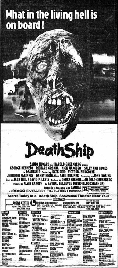
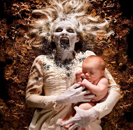
Fuck Winter—Halloween’s coming!

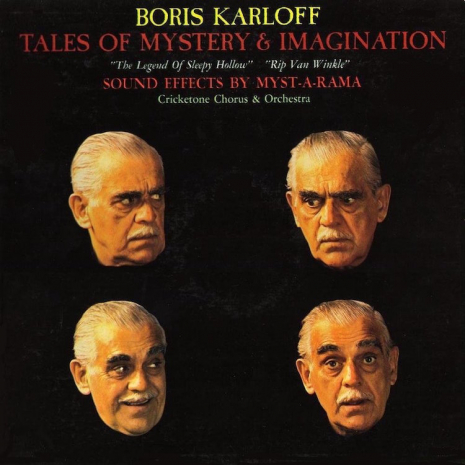
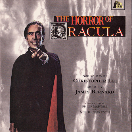
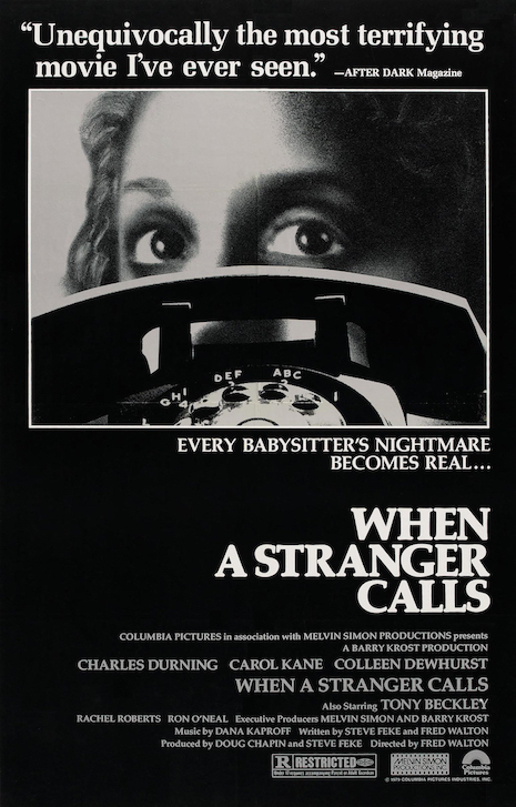
Moving apartment, packing and unpacking boxes of belongings, I rediscovered a few old LPs and cassette recordings of the likes of Vincent Price, Boris Karloff and David McCallum telling tales of terrible things I’d long forgotten. Suppressed memory, you might say. It was quite a discovery, happy and sad, like finding photographs of long lost lovers and knowing the reason you split and why you were such a dick. Recordings of horror stories which were once so very, very important but now much less so. Perhaps

These were recordings of the very best reading great tales that could entice, enthral, and entertain.

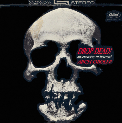
I still listen to such today. Downloading podcasts of The Horror from Relic Radio, or listening to Old Time Radio classic tales by Wyllis Cooper and Arch Obler for Lights Out, or those other shows like Suspense, Himan Brown’s Inner Sanctum, The Witch’s Tale, The Hermit’s Cave, or E. G. Marshall and his three-act The CBS Mystery Hour.. Today’s equivalent is the wonderful podcast series Tales from Beyond the Pale devised and produced by Larry Fessenden and Glenn McQuaid.

It’s not that entertainment was somehow better in the past, it is rather there was a bigger and more diverse range of imaginative material produced than all the tawdry remakes, or the repetitive Marvel superhero movies or the tick-box detective shows/sci-fi series available 24/7 today. Imagination has had its wings clipped by money, politics and Twitter mobs, and will never fly to giddy heights in a cage.

But back to the point of this post: Halloween’s coming. And here to get in the mood is a gallery of vintage album covers featuring some of biggest names in movies and entertainment (Karloff, Lugosi, Price, McCallum) reading classic tales of terror and imagination. Plus a few novelty records to show not everything was golden in the past…
 
horrorlpsHitchock01ghosts.jpg
 
horrorlpsKarloff01tales.jpg
 
horrorlpsLee02dracula.jpg
 
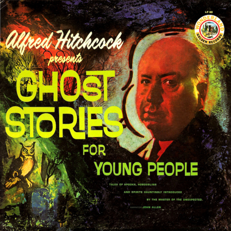
More eerie album covers, after the jump…
 

READ ON
Posted by Paul Gallagher
|
10.16.2019
08:33 am
|
‘The Sitter’: The 1977 short film inspired by an urban legend that became ‘When a Stranger Calls’
08.16.2019
08:06 am
Topics:
Tags:

Poster
 
“Have you checked the children?” “The calls are coming from inside the house!” These are familiar phrases, thanks in large part to the 1979 film, When a Stranger Calls, but did you know they originated from a certain urban legend? Or that the terrifying opening of Stranger is essentially a clone of a rarely seen short film?

The 1977 short, The Sitter, was inspired by the urban legend concerning a female teenage babysitter who receives strange, frightening phone calls in which the caller keeps asking, “Have you checked the children?” Eventually, it’s determined the calls are coming from another phone line inside of the house. The tale usually ends with a shocking, disturbing reveal. “The babysitter and the man upstairs” legend is thought to have been first circulated in the early 1960s.

Fred Walton and Steve Feke were working as writers for a fleeting TV show when they came up with the idea for The Sitter. Feke told Walton the babysitter legend, which Feke believed to have actually taken place. Walton hadn’t heard the story before, and immediately thought it was something that could be developed for the screen. Thinking that it wasn’t right for the program they were writing for, Walton and Feke decided to produce a short film. The pair co-wrote the script, with Walton directing.

Shot over just three days, The Sitter is an impressive slice of low-budget, first-time filmmaking. Feke and Walton wanted it to look as professional as possible—which included hiring Jean-Luc Godard’s cameraperson and having the film processed at the same lab used by Stanley Kubrick—and it shows in the final product. All that wouldn’t matter if The Sitter wasn’t an effective little horror picture, but it certainly is. 
 
Lucia
Little-known actress Lucia Stralser as Jill, the terrorized teen, in ‘The Sitter.’

Though the short didn’t garner the attention Feke and Walton were hoping for, the duo continued to talk up The Sitter in Hollywood. Eventually, they’d secure the backing of a wealthy financier, and the decision was made to turn the short into a feature-length film. Also co-written by Feke and Walton, with the latter once again in the director’s chair, When a Stranger Calls (1979) was produced for $1.5 million; it went on to gross over $20 million in the United States alone.
 
Lobby card
 
The beginning of When a Stranger Calls is a virtual remake of The Sitter, with similar looking shots, pacing, and running time. For Stranger, acclaimed actress Carol Kane was cast in the role of the babysitter. Kane’s first-rate performance in the opening, along with a tightening of the script for the sequence, resulted in an improvement over The Sitter. But the short is still appealing as a separate, standalone work, in part, as not everything is duplicated in Stranger; the slow, creepy Steadicam shots are particularly noteworthy.

Continues after the jump…

READ ON
Posted by Bart Bealmear
|
08.16.2019
08:06 am
|
Fangoria editor’s amazing collection of classic trash horror film ads
10.04.2018
11:37 am
Topics:
Tags:


The ongoing triumph of digital is pushing into the grave many art forms once so ubiquitous (and tethered to low commerce) we hardly think of them as arts. Packaging art dives into decline as physical media formats become obsolete; screen printed concert posters become a pricey commodity-fetish item as Facebook becomes every promoter’s kiosk. Somehow, and encouragingly, event postcards continue to thrive, but really think about this—when was the last time you decided to see a movie or buy recorded music based on a newspaper ad?

Longtime Fangoria editor Michael Gingold remembers when the local daily was THE way to keep up on movies, and in fact, it was the lurid daily print ads for trash horror films—rendered all the seedier by the way cheap black ink used to block up on cheap pulpy newsprint—that sparked his lifelong interest in the horror genre. Gingold even kept a scrapbook of them, and eventually published them in a xeroxed ‘zine called Scareaphenalia.

Arranged on a desk in the back of my junior high homeroom was the communal stack of Daily News for teachers to pick up. There were always a couple of ’em left over, and the first Friday of that month I grabbed one and flipped through to the movie section. There they were: boldly arresting ads for Richard Franklin’s Patrick and David Cronenberg’s The Brood, both opening that day. I was vaguely aware of Cronenberg’s name, but otherwise, these films were a mystery to me. All I knew for sure was that I wanted to see them both.

Although I didn’t get to, at least not at the time, I was so enthralled by those ads that I cut them out of the paper and saved them. And every Friday thereafter, I’d grab a leftover Daily News edition and scour it for whatever lurid gems might be advertised in its pages. Any that I found, I clipped and added to my growing collection, and soon I was doing the same with the occasional bigger genre movie announced in The Times. By the end of the year, assembling those ads had become an ongoing passion project.

The foregoing quotation is from Ad Nauseam: Newsprint Nightmares from the 1980s, a new book that reproduces Gingold’s collection, with his annotations, and excerpts from contemporary reviews. His annotations are insightful, naturally, but the inclusion of reviews was a wonderful choice—it’s interesting to be reminded that while gore-operas like The Driller Killer, The Evil Dead, and Friday the 13th are regarded as classics which boast undying (sorry) cult followings, such films were excoriated in their day by critics who practically tripped over each other in their rush to condemn the films’ violence and lord their self-presupposed moral superiority over the genre’s fans. Even A Nightmare on Elm Street received mixed reviews that grudgingly praised its creative premise, wit, and atmospherics, as they went ahead and condemned it anyway, because a slasher film simply couldn’t be offered unqualified praise. (By the time its sequel came out, critics seem to have figured out the point.) Interestingly though, of all the reviews reproduced in Ad Nauseam, astonishingly few take the genre to task for its notorious misogyny—this was the era, after all, in which the murder-as-punishment-for-female-sexuality and “final girl” tropes were codified, and while young women’s suffering was typically dwelt-on in mortifying detail, the psychotic killers themselves sometimes went on to become the “heroes” in long-running and profitable franchises.

Ad Nauseam’s publisher, 1984, were extremely cool about letting us reproduce a generous sampling of Gingold’s collection. We’ve eschewed the bigger-name films in favor of the book’s more endearingly trashy offerings—you’ve seen the poster for Halloween a million times by now anyway, right?


Many more after the jump…

READ ON
Posted by Ron Kretsch
|
10.04.2018
11:37 am
|
Bernie Wrightson’s wild artwork for ‘The Edgar Allan Poe Portfolio’ 1976
04.17.2018
10:02 am
Topics:
Tags:

02berniepit.jpg
 
In 1976, legendary comic book artist Bernie Wrightson produced a series of paintings for a limited edition set of prints featuring key scenes from the tales of Edgar Allan Poe. The portfolio consisted of eight prints and was limited to an edition of 2000. Most of these prints were signed by Wrightson, who was then still using the first name “Berni” so as not to be confused with the Olympic gold medalist diver Bernie Wrightson.

For the series, Wrightson produced eight paintings. However, the first painting for “The Pit and the Pendulum” (above) proved to be too bright and could not be used by the printers as the thick impasto paint caused considerable glare. Wrightson replaced the image with a darker far more atmospheric picture. It is noticeable that the prints have a slightly darker less vibrant appearance than their original paintings.

Also, unlike some artists who have elaborately illustrated Poe’s classic tales in dark, gothic, monochromatic tones, Wrightson’s work has a dynamic, comic book style that brings Poe’s characters and their actions alive. Best known as the co-creator of Swamp Thing, Wrightson produced an enviable catalog of work during his life, including a series of rare and much sought after illustrations for Mary Shelley’s Frankenstein and the suitably-thrilling artwork for Stephen King’s The Cycle of the Werewolf.
 
011berniepit.jpg
‘The Pit and the Pendulum’: ‘I saw clearly the doom which had been prepared for me…’
 
01bernierue.jpg
‘Murders In The Rue Morgue’: ‘As the sailor looked in, the gigantic animal had seized Madame L’Espanaye by the hair…’
 
More classic Wrightson artwork for Edgar Allan Poe, after the jump…
 

READ ON
Posted by Paul Gallagher
|
04.17.2018
10:02 am
|
Comics from Hell: Before Video Nasties and Splatterpunk there was the gory horror of ‘Weird’
03.26.2018
09:15 am
Topics:
Tags:

021weijan66.jpg
 
Cheap, nasty, gruesome, and revolting, blah, blah, blah. And these were just the good points of Eerie Comics’ gory publication Weird which ran for 69 issues between 1966 and 1981.

The brainchild of “gun-toting” publisher Myron Fass and editor Carl Burgos who “ground his axe against the entire comics industry,” Weird rehashed pre-code comic strips with violent, shocking, blood-splattered tales of Frankenstein’s monster, “Sewer Werewolves,” “Flesh-rippers.” and the “Horrorama of Squirming Demons and Vampires.”

Taking its lead from EC’s Tales from the Crypt and Warren’s Creepy, Weird eschewed any pretence for good taste and decorum and aimed straight at the teenage jugular. It literally chewed the face off its competition with nasty, badly-drawn tales of the most gruesome excesses—cannibalism, torture, murder, and sordid occult rites. If there is a need to show evidence that brutal horror does not corrupt innocent minds, then may I present Exhibit A.: Weird.
 
08weidec66.jpg
 
010weijun67.jpg
 
07weioct67.jpg
 
More cheap ‘n’ nasty horror covers, after the jump…
 

READ ON
Posted by Paul Gallagher
|
03.26.2018
09:15 am
|
Surreal sci-fi-horror artwork by prolific Dutch painter Karel Thole


Here’s looking at you, kid. An intriguing piece of work by Dutch painter Karel Thole.
 
Karel Thole was a massively prolific Dutch artist with a flair for combining both surreal science fiction themes with horror. For much of his career, Thole’s inspired artwork appeared on the cover of the number-one-selling Italian science fiction magazine (at the time) Urania. The magazine featured stories from premiere American sci-fi authors such as Isaac Asimov, Robert Heinlein, Alan Dean Foster, Philip K. Dick as well as English great, J.G. Ballard. Italian authors also contributed, though they were widely published under aliases.

Thole was born Carolus Adrianus Maria Thole in Holland in 1914. He attended an arts-focused school in Amsterdam and would find work in and around the Netherlands as an artist until he relocated with his family to Italy in the late 50s. Once in Italy Thole’s work was embraced by the Italian art community. Thanks to his notoriety in Italy, it wouldn’t take long for images of Thole’s illustrations and paintings to reach the eyes of publishers in the U.S., Germany, and France—further solidifying his legacy as one of Europe’s most popular science fiction/horror artists.

Thole’s work has been compared to other influential, instantly recognizable artists such as Salvador Dali, Hieronymus Bosch, and German Dada pioneer Max Ernst (in particular his color palette), and with very good reason. Thole’s work possesses distinct surrealist qualities—visualized in his transcendental alien landscapes or in his beautifully crafted covers for modern publications featuring the work of of H.P. Lovecraft. Surprisingly, there has yet to be a book focusing on Thole’s way-out artwork. Let’s hope that happens soon. For now, you’ll have to dig on the images in this post and then perhaps hunt down a few vintage novels which feature Thole’s artwork to add to your collection. Some of what follows is NSFW.
 

A piece by Thole for German horror novel series Vampir-Horror-Roman.
 

Cover art by Thole for an issue of Urania.
 

Artwork by Thole for Galaktika #34, 1979. The magazine was published in Budapest from 1972-1995.
 
More after the jump…

READ ON
Posted by Cherrybomb
|
01.11.2018
09:52 am
|
The technicolor covers of Spanish horror magazine Dossier Negro
12.21.2017
01:41 pm
Topics:
Tags:


One of the 217 vibrant covers of pioneering Spanish horror magazine, Dossier Negro.
 
Dossier Negro made its debut in 1968, earning it the distinction of being the first-ever Spanish horror magazine. Staff illustrators were plucked from the young and vibrant local artistic community including Leopoldo Sánchez who at the time was just twenty. Sánchez would go on provide artwork for several influential magazines, including Vampirella and Eerie, and for Marvel Comics.

During its 217 issue run work by other prominent artists would appear in Dossier Negro, such as José Ortiz (Spain), Ernesto “Ernie” Chan (aka Ernie Chua), Frank Frazetta, comic hero Bernie Wrightson (a long-time collaborator of author Stephen King) and comic master Enrique Torres-Prat/Enrich. Initially put out by Ibero Mundial de Ediciones (issues 1-124), the publishing house engaged the services of a fixture of the Spanish comic scene, Josep Toutain Vila (or José Toutain). Toutain would quickly make a connection with Jim Warren of Warren Publishing to license Warren-owned content for use by Dossier Negro as well as other comics from Italy and the UK. Later on, three different publishing houses would continue to provide a home for the wildly popular magazine. Noted in the 2012 book, Spanish Horror Film by Antonio Lazaro-Rebol, Dossier Negro remained a favorite in Spain throughout its twenty-year run which concluded in 1988.

I’ve posted 24 images of cover artwork from Dossier Negro that I know you will dig below. Some are slightly NSFW.


More after the jump…

READ ON
Posted by Cherrybomb
|
12.21.2017
01:41 pm
|
Monsters, Demons, Devils, and Donald Trump: The art of Dave Lebow
12.14.2017
11:56 am
Topics:
Tags:

010lebowsatansmuses.jpg
Satan’s Muses
 
Don’t know much about art history. Don’t know much about graphology. Don’t know much about comic books. Don’t know much about the way things look. But what I do know is what I like and what I currently like are these big, colorful, classical, fantasy, pulp fiction-type canvases by artist Dave Lebow.

Lebow’s paintings mix pop culture with fairy tales and horror fiction. His byline sez he’s “old school” with “a wickedly contemporary retro style that recalls the pulp magazines of long ago.” That’s probably why his work hits the spot and fits snugly like a blue suede shoe on my size ten feet.

You may have seen his specially commissioned paintings (giant biblical canvases) on the cult TV series Dexter or maybe his paintings on ABC’s October Road or the History Channel’s Strange Rituals. His artworks look like gorgeous illustrations from old classic storybooks by the Brothers Grimm, H. P. Lovecraft, or even Stephen King. They impart a scene from a dream-like narrative which you the viewer are invited to make up as you go along, as Lebow has said:

I want my images to grab you and drag you, if not willingly, then kicking and screaming into my picture. I’m inspired and interested in imaginative storytelling pictures that evoke an emotional response.

Originally from Oklahoma, Lebow graduated in Painting from Boston University and has an MFA in Experimental Animation from Cal Arts. Now based in California, he creates his pictures by first sketching out his idea before blocking out a version in oils then painting the full image in all its fabulous technicolor glory.

More recently, Lebow’s paintings have included some pointedly political/satirical portraits of President Trump—one as a member of the KKK another as a Nazi—which don’t seem out of place beside his more fantastical work of demons and devils and two-headed monsters. In fact, he looks right at home.

Lebow certainly gets my vote and you can see more of his work here or maybe buy a print here.
 
01lebowallthatglitters.jpg
‘All That Glitters.’
 
Many more of Lebow’s wondrous artworks, after the jump…...
 

READ ON
Posted by Paul Gallagher
|
12.14.2017
11:56 am
|
Sex and Horror: The lurid erotic art of Emanuele Taglietti
04.13.2017
11:31 am
Topics:
Tags:

022vampsxes.jpg
 
Emanuele Taglietti painted some 500 covers for various fumetti or Italian comics during the 1970s. His work featured on such best-selling adult sex and horror fumetti like Sukia, Zora the Vampire, Stregoneria, Ulula, Vampirissimo and Wallestein, among many others. At one point he was producing ten paintings a month for these titles.

Taglietti’s sex and horror paintings often featured recognizable charcters/actors from popular horror movies like Christopher Lee’s Dracula Has Risen from the Grave, The Plague of the Zombies, and Creature from the Black Lagoon. According to Horropedia, Taglietti had “a fixation” with the actress Ornella Muti on whose likeness he based the character Sukia.

Born in Ferrara, Italy, in 1943, Taglietti was the son of a set designer who worked with film directors like Michelangelo Antonioni—who was also apparently his cousin. His father regularly took the young Taglietti on to movie sets introducing him to directors, actors, and crew.

Deciding to follow his father into the film business, Taglietti attended art college where he studied design. He graduated and then enrolled at film school in Rome. He became an assistant director working with directors like Federico Fellini and Dino Risi. But this wasn’t enough for the young Taglietti. By the 1970s, he switched careers to become an illustrator for the incredibly popular sex and horror fumetti.

Taglietti signed up with Edifumetto, where he worked at designing and painting covers. His style was influenced by the artists Frank Frazetta and Averardo Ciriello. His paintings successfully managed to convey thrilling narrative with highly alluring and erotically charged action. By the 1980s, fumetti were no longer as popular. Taglietti moved onto painting and teaching. He retired in 2000 but continues to paint.

A beautiful must-have book of Taglietti’s work called Sex and Horror was published in 2015. It’s one that is well worth seeking out.
 
03werexes.jpg
 
02horrxes.jpg
 
See more of Taglietti’s delightfully lurid artwork, after the jump…

READ ON
Posted by Paul Gallagher
|
04.13.2017
11:31 am
|
Perfect posters for the genius comedy-horror TV series ‘Inside No. 9’

00stevereeceinsideno9.jpg
 
If you aren’t already, then you really should be watching Steve Pemberton and Reece Shearsmith‘s masterful series Inside No. 9, which is currently rolling out for a third season on BBC television.

Shearsmith and Pemberton, alongside Mark Gatiss and Jeremy Dyson formed the finely-tuned quartet of young writers and performers who saved British television comedy from near irrelevancy in 1999.

Together they called themselves, and their comedy series, The League of Gentlemen. In the long history of British comedy, these guys were the most important new arrivals on the telly since say The Comic Strip Presents…, or The Young Ones or even further back to Monty Python. Their show was a fearless mix of horror and comedy which became an international cult hit leading to the inevitable book, movie, and stage production. Along with The Office, the three series of The League of Gentlemen are the crown jewels of this generation of BBC comedy productions. The best of the best.

In 2002, when The League of Gentlemen finished their run on television.  Dyson went off to write very good novels and stage shows. Gatiss sharpened his nib working on Doctor Who and then stunned the planet by co-devising and writing Sherlock. The Lennon & McCartney of the band, Pemberton and Shearsmith continued in their own wicked ways writing and starring in the much darker sitcom Psychoville and most importantly Inside No. 9 in 2014.

Inside No. 9 is an anthology series, much in the style of those masterful compendium horror films produced by Amicus Productions in the sixties and seventies like Dr. Terror’s House of Horrors (1965), Tales from the Crypt (1972), and From Beyond the Grave (1974). Each episode offers up one complete mini-movie written by and starring Pemberton and Shearsmith alongside such renowned actors as David Warner, Gemma Arterton, Rula Lenska, Sheridan Smith, Jessica Raine and Roger Sloman. The tales range from haunting ghost stories to Gothic horror to troubling psychological thrillers—all neatly laced with the deadliest of black comedy. And as with the Amicus films, each 30-minute drama has an unnerving and genuinely unexpected twist.

The third series has already started—and it’s utterly fantastic. Which understandably explains why the BBC have already commissioned a fourth one for 2018.

Inside No. 9 is promoted by a lovingly produced movie poster which captures the style and genre of each production. As a fan of the show (and all the work of Messrs. Pemberton and Shearsmith), I thought these posters are something well worth sharing. The first was designed by Graham Humphreys who produced the knock ‘em for six poster for Sam Raimi’s The Evil Dead. Each of these beautiful artworks is a mouthwatering appetizer for the main dish—which, as said, if you aren’t already watching then you should be feasting on them right now.
 
011insideno9.jpg
Sardines’ Season One #1, February 5th 2014, poster by Graham Humphreys .
 
012insideno9.jpg
A Quiet Night In’ Season One #2, February 12th 2014, poster by Matt Owen.
 
More posters promoting the god-like genius of Pemberton & Shearsmith, after the jump…

READ ON
Posted by Paul Gallagher
|
03.01.2017
01:40 pm
|
Two Star Movies, Five Star Posters: The B-movie artwork of Albert Kallis

00zbeatsmillioney55.jpg
‘The Beast with a Million Eyes’ (1955).
 
Albert Kallis was working as a graphic artist with Saul Bass when the twentysomething B-movie director Roger Corman met him at a poster exhibition sometime during the mid-1950s. Corman liked the high-end artwork Kallis was putting out for the big Hollywood studios like Paramount and 20th Century-Fox. He wanted to know what it would take to have Kallis come and work for him? Kallis said he’d be only interested if after any “general conversations about the approach to the picture” all decisions on the poster’s artwork and style was left entirely up to him. Corman agreed. And that’s how he bagged the talents of one of the greatest movie poster artists of the 1950s and 1960s.

Corman made B-movies. Exploitation. Cheap thrills. Schlock horror. He knew he could make a ton of money if only he could get the teenagers to come and see his films. This was the time of the drive-in when movies came into town for a week and then were gone. When the film houses would only take on a movie if they could guarantee a hefty profit. What Corman needed was someone to sell his pictures with a poster that made the audience say “I gotta see that!” Kallis fully understood this. He produced artwork that made even the trashiest z-list feature look like it was the Citizen Kane of cheap thrills.

Kallis spent some seventeen years working as art director for Corman and then at American International Pictures—-going on to share responsibility (with Milt Moritz) as head of advertising and publicity. Kallis’s artwork exemplifies the best of movie poster technique and composition, taking key elements from a film to draw in the viewer and excite them enough so that they create their own mini-narrative. One look at these beauties and it’s more than apparent no movie could ever live up to the thrills of Kallis’s artwork.
 
018zdayworldende55.jpg
‘The Day the World Ended’ (1955).
 
04zphantom10000leag55.jpg
‘The Phantom from 10,000 Fathoms’ (1955).
 
More cheap thrills, after the jump….

READ ON
Posted by Paul Gallagher
|
02.08.2017
11:47 am
|
Satan teens, blood, guts, LSD, murder and chaos: ‘Where Evil Dwells’ has it all but a plot

01whereevil.jpg
 

“Ricky was of the devil. When he was on acid, he’d go back into the dark woods, up in Aztakea, and he would talk to the devil. He said the devil came into the form of a tree, which sprouted out of the ground and glowed. I tried to question him about it, but he said, “I don’t like to talk about it. People think I’m nuts.”

Ricky would take ten hits of mesc in a night. He would take three; ten minutes later he’d take another three; and two hours later he’d take four more. He’d figured it out in his mind how to take the most without ODing Ricky is the acid king. “

—Mark Fischer, friend of “Acid King” Long Island teen murderer Ricky Kasso, in Rolling Stone magazine.

What the fuck did I just watch? is often the response to Tommy Turner and David Wojnarowicz‘s cult 1985 no wave/transgressive film Where Evil Dwells. Not because some viewers of this splatterfest are uncool dickheads but because there is no real cohesive story or structure to Turner and Wojnarowicz’s film—and people really do prefer things like structure and stories. Just ask James Patterson. Our savvy public are none too appreciative of being buttonholed by a would-be weirdo rambling incontinently about conspiracy theories, Satan, murder and devil dolls—people get enough of that shit on the evening news.

Moreover, to give 28 minutes over to watching this is a considerable investment of time for something that may not be that good after all—especially true in a world that’s marked out in 140 characters or less. But wait, let’s not be too hasty or too cynical, for there’s a reason there is no real story to Where Evil Dwells. It is (apparently) because this is all that remains of a much longer intended feature length project which was lost in a fire. The only footage that survived was put together for the Downtown New York Film Festival in 1985, which makes Where Evil Dwells interesting for what it could have been. And it certainly does contain some very interesting things.


Where Evil Dwells was loosely based on the PCP-fuelled murder of young Gary Lauwers in Northport, New York, on June 16, 1984. His killer, 17-year-old hesher Ricky Kasso was painted by the press as an occult dabbling, drug-addled Satan freak, and not without good cause. In an attack that went on for longer than an hour, Kasso burned Lauwers, gouged out his eyes and stabbed him somewhere between 17 and 36 times. At some point during the attack, Kasso is said to have commanded Lauwers to “Say you love Satan,” but Lauwers is said to have replied, “I love my mother.”

After Kasso bragged about Lauwers’ murder to several of his friends, claiming the killing was a “human sacrifice” that Satan (via a black raven) had commanded him to carry out, even taking some of them to see the decomposing body, an anonymous tip was made to police. On July 7, two days after his arrest, Ricky Kasso committed suicide by hanging himself in his jail cell.

The Long Island Satan teen murder case was made famous nationally in a widely read 1984 Rolling Stone article (”Kids in the Dark” by David Breskin in the November 22 issue) and in the (nearly fictionalized) lurid “true” crime novel Say You Love Satan. Kasso—basically a troubled AC/DC loving idiot who became a very sucessful fuck-up—was almost made out to be the “new” Charles Manson by the likes of Sonic Youth, Big Audio Dynamite, the Electric Hellfire Club and the Dead Milkmen. Where Evil Dwells is not the only film or documentary to be made about Ricky Kasso, although it was the first.

More murder, LSD and Satan teens after the jump…

READ ON
Posted by Paul Gallagher
|
01.13.2017
12:42 pm
|
Macabre, gothic illustrations for Edgar Allan Poe’s ‘Tales of Mystery and Imagination’
10.28.2016
12:42 pm
Topics:
Tags:

030harryclarkecovereap.jpg
 
There are few volumes more suitably macabre for dipping into at this time of year than Edgar Allan Poe’s Tales of Mystery and Imagination. I had for many years an old Pan paperback of Poe’s stories—one I’d treasured since childhood—until this fine dog-eared friend started setting lose its pages. When I replaced it, I was fortunate to find a battered old volume with fabulous illustrations by Harry Clarke. An original edition of this book can set you back a few hundred bucks. Thankfully, the thrift store where I chanced upon my 1928 edition was more than charitable in its pricing and I paid no more than the cost of an average family-sized coffee.

Clarke’s beautiful, intricate—and yes, at times—rather grotesque illustrations are a perfect fit for Poe’s weird tales. Clarke (1889-1931) was a prolific artist and illustrator. An Irishman who produced over 130 beautiful and ornate stained glass windows for churches all over Ireland and in England and France. Yet, for all their magestic beauty Clarke’s greatest fame came from his book illustrations—most notably for the Fairy Tales of Hans Christian Andersen (1916), the Fairy Tales of Charles Perrault (1922), Goethe’s Faust (1925), and especially the two editions of Poe’s Tales of Mystery and Imagination in 1919 and 1923.

The 1919 edition of Poe’s collected stories were accompanied by a series of Clarke’s monotone illustrations. The 1923 edition was further enriched by the addition of eight color plates. I never tire of looking at Clarke’s illustrations. They are incredibly rich and filled with small intricacies that delight even after far too many viewings. Sure, he may have dipped his pen in the well of Aubrey Beardsley’s blackest ink but Clarke’s penmanship and artistry are singularly his own.
 
08fallhouseusher.jpg
The Fall of the House of Usher.’
 
10fallhouseusher.jpg
The Fall of the House of Usher.’
 
More dark delights, after the jump…

READ ON
Posted by Paul Gallagher
|
10.28.2016
12:42 pm
|
Night Gallery: A connoisseur selection of bloody, gruesome & sexy Giallo and horror movie posters
10.27.2016
12:45 pm
Topics:
Tags:


7 Deaths in the Cat’s Eyes  (Italy/France/West Germany, 1973)    d. Antonio Margheriti     Italian 4F Manifesto     55x78

You may recall last month, when—against my better instincts as a collector of these things—I recommended my new favorite online movie poster shop, the Los Angeles-based Westgate Gallery. Why spoil one of the least picked-over bastions of high-end movie posters on the entire Internet for myself, right? Well anyway, I did share it with our readers and apparently y’all turned out in force and picked the place clean.

But fear not, Westgate’s deeply knowledgeable self-described “poster concierge” Christian McLaughlin has unleashed over two hundred new sophisticated eye-popping wall coverings for your perusal and purchase. He obviously had to turn over a lot of rocks (many of them in Italy, from the looks of things) to find posters like the ones you see below. Trust me, you can search through eBay for thousands of pages—I do it all the time—and not find the gold like this passionately persistent and proficient poster prospector can.

And right now—as in right now and for the next seven days only, there is a 30% off Halloween sale—every item in stock—going on at the Westgate Gallery. Just enter the discount code HFS30 at the checkout.

Here’s a selection of some of the best from the latest crop of rare posters at Westgate Gallery...


Slasher Is the Sex Maniac  (Italy, 1972)  d. Roberto Montero     Italian 4F Manifesto       55x78
 

Jack the Ripper   (Switzerland/West Germany, 1976)    d. Jess Franco     Italian 2F Manifesto   39x55
 
Many, many more after the jump…

READ ON
Posted by Richard Metzger
|
10.27.2016
12:45 pm
|
Photographer uses his own kids to create terrifying pictures of our darkest nightmares
10.05.2016
03:02 pm
Topics:
Tags:

005nightmarehoffine.jpg
 
Kids are smart. They know there really is something lurking under the bed just a-waiting to grab their ankles and chow down on their flesh. They know behind that closet door—the one that always drifts open for no damned good reason—is a hideous, fanged-beast just a-watching for its moment to pounce. They know that’s not the wind turning in the eaves, or mice scurrying across the basement floor. No. It’s monsters!

Photographer Joshua Hoffine likes horror movies. He is a horror movie buff. Taking his inspiration from such horror tropes as the monster under the bed or the creature in the closet, Hoffine creates terrifying pictures of our deepest, darkest fears.

Hoffine was also inspired by reading bedtime stories to his daughters and works with his five daughters to produce his candy-colored nightmares.

He believes a horror story is “ultimately concerned with the imminence and randomness of death, and the implication that there is no certainty to existence.”

Horror tells us that our belief in security is delusional, and that the monsters are all around us.

His daughters enjoy working with their father on these nightmarish visions and are more interested in getting a free cookie than in being scared by the terrors being depicted around them.

Hoffine is currently compiling a book of his Horror Photography and more of his awesome work can be seen here.
 
001nightmarehoffine.jpg
 
002nightmarehoffine.jpg
 
More scary and disturbing family horror, after the jump….

READ ON
Posted by Paul Gallagher
|
10.05.2016
03:02 pm
|
Page 1 of 3  1 2 3 >