FOLLOW US ON:
GET THE NEWSLETTER
CONTACT US
Not for the faint-hearted: Gruesome medical illustrations from the 19th-century (NSFW)

01surgeryillus.jpg
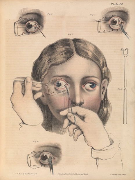
Surgery to correct strabismus, a misalignment of the eyes.
 
The artist Francis Bacon spent many hours poring over illustrated medical books looking at surgical procedures on mouth and tongue cancer, hare-lip correction, and tracheotomies. He declared these image beautiful, in particular the way in which the artist had used color to represent a tongue or a mouth. It was something he tried to recreate in his own paintings. Bacon was a voracious reader. After his death, more than 1,000 of his books were donated to Dublin’s Trinity College History of Art Department and the City Gallery, the Hugh Lane. Among this collection are works by Beckett, Nietzsche, T. S. Eliot, De Beauvoir, Elizabeth David cookery books, and a well-used set of medical textbooks, some illustrated by Frank Netter, others containing work by Joseph Pancoast (1805-82).

Pancoast was an American surgeon who pioneered many techniques in surgery and in particular plastic surgery. He also wrote the highly influential book A Treatise on Operative Surgery, first published in 1844, which compiled various surgical procedures or “processes” that exhibited the “state of surgical science in is present advanced condition.” The book contained some 80 color-plates and 486 illustrations, and was further enlarged in 1846.

Illustrations from another medical book that caught Bacon’s interest was Précis iconographique de médecine opératoire et d’anatomie chirurgicale by Claude Bernard (1813-1878), a French physiologist, who has been described as “one of the greatest of all men of science.” Bernard was the first to use “blind experiments” by which information is kept from the participants to eliminate any possible bias. He also believed scientists must endeavor to disprove their own theories as scientists can “solidly settle” their ideas “only by trying to destroy [their] own conclusions by counter-experiments.”

Like Bacon, I’ve had a long fascination with old medical textbooks and their illustrations as I find the artists’ depictions of surgery and disease beautifully capture the essential frailty of the human condition. However, some readers may find a few of the following illustrations potentially disturbing. You have been warned.

 
03surgeryillus.jpg
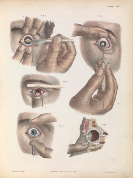
The removal of cataracts.
 
08surgeryillus.jpg
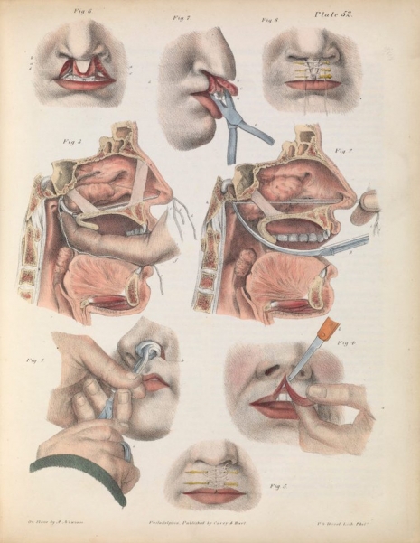
Surgery for correcting a harelip.
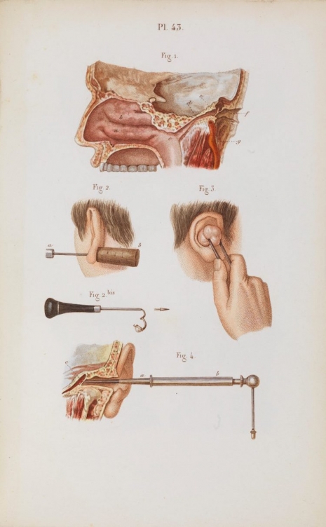
 
010surgeryillus.jpg
Ear surgery.
 
Far more disturbing surgical procedures, after the jump….
 

READ ON
Posted by Paul Gallagher
|
12.12.2018
09:22 am
|
Miscreants rejoice! Artist Krent Able’s new ‘appallingly filthy’ illustrated book is coming!
11.19.2018
01:54 pm
Topics:
Tags:


The cover of the forthcoming book ‘The Second Coming of Krent Able’ by Steve Martin.
 

“This book will make the perfect Xmas gift for elderly relatives, beloved friends, and hated enemies.”

—London-based artist and illustrator Krent Able (the alter-ego of author Steve Martin) on his upcoming book, The Second Coming of Krent Able.

If you think Mr. Able’s statement about the follow-up to his gritty Big Book of Mischief (2012), The Second Coming of Krent Able, sounds like a warning wrapped in a delicious piece of candy, you would be correct. There is nobody quite like Krent Able, a long-time illustrator of morally questionable comics, that initially ran in the UK bi-monthly mag The Stool Pigeon (RIP, 2013). Able’s work has also disgraced the pages of the Guardian and NME, often depicting musician Nick Cave as the no-good chain-smoking “Doctor Cave.” Or meat-is-murder crusader Morrissey, looking forward to devouring a plate of bloody entrails topped with a skinned animal head—one fixated dead eyeball staring right at you because, even though it’s dead, it is as confused about this fucking situation as you are. 

Does this mean Krent Able is a malapert of the highest order, here to provide us with “appallingly filthy” comic book tales full of mayhem, dicks, and death? Assuredly the answer to this question is yes, and knowing Krent’s Second Coming is coming is great news indeed. As a graphic novel enthusiast (amusingly, my last was 2017’s Nick Cave: Mercy on Me), and proud owner of Big Book Of Mischief, I can safely say The Second Coming of Krent Able will be chock full of vitriolic comics which will disgust and delight you at the same time. If you enjoy subversive subject matter, I’m sure you will enjoy looking at some NSFW images from Able’s forthcoming book, courtesy of the artist himself. If you’d like to learn more about Able, check out the engrossing, award-winning short documentary, Ink, Cocks, & Rock ‘N’ Roll (2017) which will give you yet another reason to appreciate the artist and his ultra-salacious take on satire.

The Second Coming of Krent Able is due out in the UK and U.S. on December 13th, 2018. Signed copies of the book can be pre-ordered here.
 

The not-so-good Doctor Cave by Krent Able.
 

William Burroughs and his creepy pal.


Much more after the jump…

READ ON
Posted by Cherrybomb
|
11.19.2018
01:54 pm
|
Undead, Undead: John Coulthart’s beautiful illustrations for Bram Stoker’s ‘Dracula’
09.04.2018
08:50 am
Topics:
Tags:

dracula01.jpg
 
We all know what Dracula looks like. Bela Lugosi and innumerable Hammer horror movies starring Christopher Lee have fixed the Count in our imagination. He’s tall, gaunt, interestingly pale, with slicked back hair, and a set of unfeasibly large canine teeth. He sports a cloak, and what appears to be an evening suit which can often make him look like a nightclub doorman or a shifty croupier at a Mayfair casino dealing from the bottom of the pack. When commissioned to provide the illustrations for a new edition of Bram Stoker’s enduring tale, artist John Coulthart decided to keep his work faithful to the source material.

Coulthart had previously been commissioned by the same publisher to illustrate Mary Shelley’s Frankenstein with which he had similarly “opted for fidelity to the text and period details “:

Despite its epistolary form, Dracula is much more readable (in a contemporary sense) than Frankenstein, so more people will have read Stoker than Shelley; but the sheer scale of cultural mauling that Dracula has been subject to means that—as with Frankenstein—even the allegedly faithful adaptations often deviate from the novel. The lounge-lizard vampire that everyone knows was a creation of Hamilton Deane’s 1924 stage adaptation, the success of which led to Tod Browning’s film and Bela Lugosi’s performance (which I’ve never liked); film and theatre may have made Dracula universally popular but the Lugosi stereotype has overshadowed the more powerful and violent character that Stoker gives us, with his bearded face, hairy palms and glowing eyes. So that’s who you see here, although the restrictions of time and brief (one picture per chapter) meant that some of the moments I’d have liked to illustrate had to be forfeit. Poor old Renfield gets short shrift, and some of the minor male characters are out of the picture altogether.

Regardless of the constrictions of time and remit, Coulthart’s illustrations for Dracula are among the very best ever produced, as his detailed work fully captures the intense, eerie, menacing, and almost dreamlike atmosphere of Stoker’s novel where you can “believe in things that you cannot.”

See the complete set of John Coulthart’s marvellous illustration fro Dracula here.
 
dracula02.jpg
 
dracula03.jpg
 
dracula04.jpg
 
See more of John Coulthart’s superb illustrations for ‘Dracula,’ after the jump…
 

READ ON
Posted by Paul Gallagher
|
09.04.2018
08:50 am
|
The wonderfully weird illustrations of Artuš Scheiner
12.28.2017
10:09 am
Topics:
Tags:

01artus.jpg
 
City dweller, successful fella, worked in a bank as a clerk but he thought to himself, “I want to live a life that’s a lot less monetary.” So he taught himself to paint and draw and all his friends who saw his work said “Cor! You ought to take this up, seriously.”

And that, in the musical stylings of Blur, is a brief introduction to Artuš Scheiner (1863-1938), the quiet little white collar worker who gave up his career as a pencil-pushing, number-cruncher at the Financial General in Prague, to become one of Bohemia’s most successful artists and who produced a phenomenal amount of work during his seventy-five years.

Yet, for such an industrious and commercially successful artist, there is, perhaps surprisingly, little written, well, in English at least, about Scheiner other than he lived, he worked and he died, which is really quite fine as it means we get to concentrate solely on the work he produced.

In his twenties, Scheiner started selling comic illustrations to the local newspapers and magazines. He had taught himself how to draw and paint but kept his passion a secret in fear he would be ridiculed for having such high ambition. His early cartoons won him admiration and so encouraged, Scheiner soon progressed to working as an illustrator of folk tales, fairy tales, and children’s stories (like Charles Kingsley’s The Water Babies). His main work was featured in a series of best-selling volumes of Czechoslovak fairy tales by the likes of Božena Němcová, Václav Tille, and Karel Jaromír Erben.

His work followed in the elaborate and highly detailed secessionist style popularized by the likes of Gustav Klimt. Scheiner’s illustrations were compelling in their bold, confident lines and strong use of color, and especially in Scheiner’s ability to make his drawings filled with drama, movement, and dark menace—an unsettling sense that something weird and strange is about to unfold.
 
02artus.jpg
 
03artus.jpg
 
04artus.jpg
 
More fabulous illustrations, after the jump…
 

READ ON
Posted by Paul Gallagher
|
12.28.2017
10:09 am
|
‘All I See Are Monsters’: Amusing Polaroids of imaginary creatures in everyday surroundings
10.10.2017
09:14 am
Topics:
Tags:

02grubcanweeatit.jpg
‘Can we eat it?’
 
We all know monsters are everywhere, don’t we? It’s not just at Halloween that monsters like to creep out from under the bed, or crawl up from the depths of that dark, dank cellar, to scare the bejesus out of people. Monsters are everywhere—but we just have to know where to look.

Artist, illustrator, and purveyor of fine goods, Martin Grubb likes to imagine monsters are all around us too. So much so, it inspired Mr. Grubb to create All I See Are Monsters, a series of fabulous Polaroid photographs of just what some of these imaginary beasts might just look like and what they might be up to.

Grubb creates his pictures at his home in Glasgow. He starts off by photographing himself with whatever props he has to hand. “I then use Photoshop,” Grubb tells Dangerous Minds, “to add monsters with the idea that monsters are all around us but go mostly unseen.”

Some of these creatures are far closer than we may like to think.

“Some people have monsters inside,” says Grubb, “these monsters can be destructive or a hindrance but maybe some can be of comfort.”

Apart from creating works of monstrous beauty, Grubb also runs an independent art boutique and gallery supporting local and worldwide artists, illustrators, and jewelry-makers called The Shop of Interest. If this tickles your fancy (and why wouldn’t it?), then you can see more of the talented Mr. Grubb’s work at Grubby Arts or visit his boutique gallery here.
 
03grubBandmates.jpg
‘Bandmates.’
 
04grubwhycantibebatman.jpg
‘Why can’t I be Batman?’
 
More Grubby monsters, after the jump…

READ ON
Posted by Paul Gallagher
|
10.10.2017
09:14 am
|
1870 A Space Odyssey: Astoundingly prophetic illustrations for Jules Verne’s ‘Around the Moon’
09.14.2017
07:19 am
Topics:
Tags:

021julesmoon.jpg
 
Top fact: Jules Verne is the most translated French author ever.

Second slightly more impressive fact: Jules Verne is the second most translated author in the world, not too far behind Agatha Christie but ahead of William Shakespeare.

In the English-speaking world, Monsieur Verne may still have the reputation as a children’s author whose best-selling books have provided prime material for a lot of Hollywood movies but in truth, Jules Verne is the “Father of Science-Fiction.” Verne produced his best-known works like Journey to the Center of the Earth (1864), Twenty Thousand Leagues Under the Sea (1870), and Around the World in Eighty Days (1873), long before his nearest rival H.G. Wells ever considered putting pen to paper.

At school, Jules Verne was the type of author whose novels were doled out during reading class and awarded (if you were lucky) at prize givings for academic excellence. That kind of thing. There was something wholesome about Verne and to an extent, H.G. Wells. A real belief that reading these authors inspired the right kind of enquiring mind—one driven by an interest in understanding the world through scientific investigation. Which was kinda strange as our teachers were a bunch of Christian Brothers whose remit was to instill the fear of God, teach some useful education, and offer the requisite religious instruction to live a good Catholic life.

Well, I suppose one out of three isn’t bad for the effort.

This was when America was firing rockets at the Moon, something that made Verne seem prescient and relevant in a way figures like Nostradamus never do. I’d read From the Earth to the Moon and thought it interesting but slightly disappointing as (unlike say Wells’ The First Men in the Moon with its insectoid creatures the Selenites) the book was mainly concerned with the scientific practicalities facing the Baltimore Gun Club in their ambitions (and rivalries) to send a rocket to the Moon. I was far more impressed by the follow-up novel Around the Moon which continued the adventures of the first three astronauts—Impey Barbicane, Captain Nicholl, and Michel Ardan (along with their dog)—who were fired in a bullet-shaped rocket from a giant cannon—the Columbiad space gun—up into space.

Verne’s novels were highly entertaining and his ideas always seemed feasible. One book, Paris in the Twentieth Century, which was written in 1863 but not published until 1994 having languished in locked bronze safe for almost a century, described the very world in which we live today, as Oliver Tearle notes in his compendium The Secret Library:

[Paris in the Twentieth Century] had been written in 1863 but [was] set in the then far-off future world of 1960. It described a world in which people drive motorcars powered by internal combustion and travel to work in driverless trains. Their houses are lit by electric light. They use fax machines, telephones and computers, and live in skyscrapers furnished with elevators and television. The criminals are executed using the electric chair. Greek and Latin are no longer widely taught in schools, and the French language has been ‘corrupted’ by borrowings from English. People shop in huge department stores, and the streets are adorned with advertisements in electric lights. Money has become everyone’s god. The novel also describes a tall structure in Paris, an electric lighthouse that can be seen for miles around. This was in 1863; the Eiffel Tower would not be built until 1889.

Similarly, many of the ideas in Around the Moon are scientifically possible and uncannily descriptive of how an Apollo misison to the Moon would return to Earth—jet rockets for thrust and a landing in the sea. The artist Émile-Antoine Bayard was tasked with illustrating Verne’s novel and he produced a set of images which are rightly described as “arguably the very first to depict space travel on a scientific basis.”
 
01julesmoon.jpg
 
02julesmoon.jpg
 
Take off with more incredible illustrations from Verne’s ‘Around the Moon,’ after the jump…
 

READ ON
Posted by Paul Gallagher
|
09.14.2017
07:19 am
|